3/7/10

Piano Mode For MP3

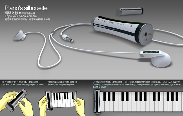
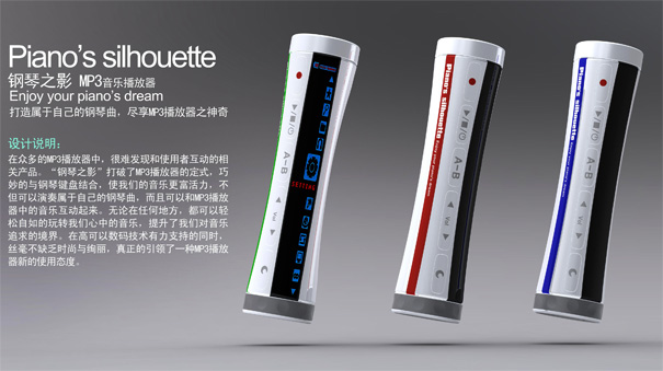
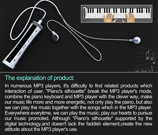
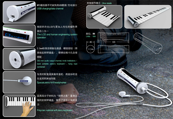
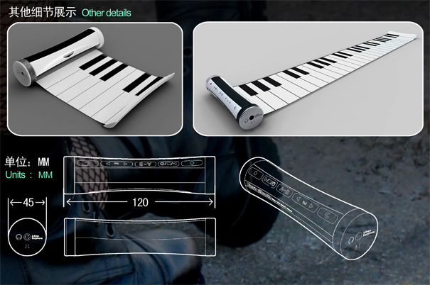
Most digital players come with an array of bizarre functions, some essential and some of them frivolous. If bizarre is the name of your game, then I’m sure you will appreciate the Piano Silhouette, an MP3 player that comes with a roll-out piano keyboard. So you can listen to music and make some too! For now it only allows you to play along with the music, kinda like reverse karaoke. *But what will be really kickass is if it allows you to record compositions directly to the player.

*Assuming that you don’t suck at playing the piano!

Designer: Jia Peng

Piano Silhouette MP3 Player by Jia Peng

piano_player2

piano_player3

piano_player4

piano_player5

piano_player8

Yanko design

Ford Mondeo 2011 xuất hiện trong tháng tám tới

“Gã khổng lồ Detroit” Mỹ, Ford Motor, vừa tiết lộ những hình ảnh và thông tin ban đầu về mẫu Mondeo phiên bản mới, 2011.
Ford Mondeo 2011
Ford Mondeo 2011.

Được giới thiệu tại triển lãm Moscow International Automotive Salon vào cuối tháng 8 sắp tới, Ford Mondeo 2011 đổi thay với lưới tản nhiệt mới, nắp ca-pô được thiết kế lại, cụm đèn hậu LED.

Nội thất của Mondeo 2011 cũng có một số thay đổi nhất định như bảng điều khiển trung tâm được thiết kế mềm mại hơn, hệ thống đèn LED bao quanh cụm điều khiển trung tâm, và ốp cửa mới, đồng thời được bổ sung hệ thống định vị vệ tinh.

Dưới nắp ca-pô, những tùy chọn động cơ cho Ford Mondeo bao gồm động cơ 2.0L EcoBoost cho công suất 200 mã lực, động cơ 2.0L EcoBoost phiên bản cho công suất 240 mã lực, hoặc động cơ Duraorq TDCi 2.2L có công suất 197 mã lực, và 3 động cơ 2.0L Duratorq TDCi với các hiệu suất lần lượt là 113 mã lực, 138 mã lực và 161 mã lực.

Hộp số bán tự động PowerShift sáu cấp là trang bị tiêu chuẩn cho phiên bản sử đụng dộng cơ EcoBoost và tùy chọn đối với bản vận hành nhờ động cơ 2.0L Duratorq TDCi có công suất 138 mã lực và 161 mã lực.

Ford cho biết phiên bản 240 mã lực của động cơ xăng tăng áp 2.0L EcoBoost, dù sức mạnh được tăng lên nhưng vẫn chỉ có hàm lượng khí thải CO2 bằng phiên bản 203 mã lực, ở mức 179g/hm.

Để cải thiện việc sử dụng hiệu quả nhiên liệu, Ford Mondeo 2011 sử dụng hệ thống phanh tái tạo năng lượng, chế độ Eco Mode được bổ sung và hệ thống Active Grille Shutter, hệ thống cảnh báo lái xe Driver Alert, hệ thống cảnh báo thông tin điểm mù, hệ thống giới hạn tốc độ và camera chiếu hậu.

Theo John Fleming, Giám đốc, kiêm CEO Ford Châu Âu: “Ford Mondeo phiên bản mới đã được thay đổi những điểm nhất thiết kế quan trọng, được trang bị những công nhẹ mới nhất mà chúng tôi sắp giới thiệu, chúng tôi kỳ vọng Mondeo 2011 khẳng định lại vị thế của Mondeo trên thị trường xe Châu Âu.”

“Đây là mẫu xe tiện lợi, an toàn nhất và khá thân thiện với môi trường, có chất lượng tốt nhất mà chúng tôi từng ra mắt trong dòng sản phẩm Mondeo.”

Ford chính thức đưa Mondeo thế hệ mới ra thị trường Châu Âu từ tháng chín năm nay.


Theo Tienphong

Book Review: Box, Bottle, Bag, by Andrew Gibbs

dieline_book_01.jpg

It's a pity that photos aren't edible, because Andrew Gibbs's Box, Bottle, Bag contains a lot of tasty looking packaging, which unfortunately contain soap as often as food. Taking the best designs from his website the The Dieline, Gibbs has produced a lovingly photographed book of packaging accompanied with copy about the agency that designed it, often including quotes about the project. Although it's broken ito six chapters, including Luxe, Bold, Crisp, Charming, Casual and Nostalgic, frankly, it's all pretty luxurious (even "Ugly Mug Coffee"). Instead, those categories serve to denote which cultural signifiers the designers wanted for their products. With the printed word harking back to Guttenberg and the development of script reaching even further into history, modern day graphic and package designers have an broad and deep lineage of visual forms to chose from.

dieline_book_05.jpg

Every font sends a message about the product's "style," and by proxy the style and persona of the buyer. The chapter that's called nostalgia, for example, includes visual references to the turn of the (20th) century, allusions to the Vargas girls festooned to the sides of WWII bombers and toys appropriate for the children of the men who fought in that war. To the modern buyer, wearing their pseudo-ironic Buddy Holly glasses, the whole of the 20th century can be appropriated as nostalgia. Designers now have computer tools robust enough to create virtually any visual impression, and they get to sell that to an audience raised in a media saturated environment that prepared them for all of those cues. In short, it's a pretty good time to be a packaging designer, and the variety and contrast of the products shown in Box, Bottle, Bag make a strong case that today's packaging designers can do more with a computer, a color printer, and the eponymous die cutting machine than their forebearers could ever do by hand. Left unanswered is whether being able to produce endless objects that look "luxe" and individualized is a good thing, when the products contained within often lack the loving care that their shiny outsides advertise.

dieline_book_04.jpg
dieline_book_06.jpg

In his introduction Gibbs asks if "you've ever been influenced to buy something solely because of its packaging?" He has, I have, and it's highly likely that his assertion that we all have is also true, at least living in the Western World in the twentieth century. Looking through the beautifully designed pages, I can't deny that if I consumed Melt chocolate, my brain would likely hijack my tongue and subtly influence my taste buds to have a better experience than one Hershey could provide, in part just because their crisp white and brown packaging screams out taste me by virtue of the five chocolaty fingerprints that mar its white surfaces. Likewise with the simple fonts and forms of Apothia hand wash, which manages to look as though it might refresh me more than liquid Dial, even though both ingredient lists probably clean me with the same sodium laureth sulfate.

dieline_book_03.jpg

Interestingly, although the Crisp section had the most cleansers and the Casual section had the most juices, the range of products was pretty consistent across all categories. In each section could be found lots of fluids (soda, juice, wine, and liquors), some semisolids (yogurts, soaps, cosmetics, etc.) and even fewer solids (chocolate and the jarring inclusion of a rubber band gun). Cynics might say that those liquid products are the ones with the highest markups ... the products with the least substance, literally. Perhaps more optimistically, those fluid products are the ones where the actual visual appearance of the product (yep, it's wine alright) varies so little and sends no signifiers that the graphic designer's role becomes pivotal. They have to visually broadcast taste. Precisely which one it is, unfortunately, is nearly impossible to disentangle from the same human emotional core that makes $100 wine taste better than $5 wine (they've done studies), but to see all of these products in such an abstract way allows the viewer to judge them on their visual merits alone, at least until we get our hands or mouth or nose on a what's inside a bottle of JAKQ cellars wine, it will be pretty hard to know for sure.

dieline_book_08.jpg
dieline_book_07.jpg
Core77

Book Review: Inventors and Innovations, edited by Duncan McCorquodale

inventors_inventions_01.jpg

A gentleman named Charles Fredrick Wiesenthal was the first to realize that putting the eye in the middle of the needle could aid in rapid mechanistic stitching in 1775. Later, Elias Howe perfected the lockstitch sewing machine, but it was Isaac Merritt Singer who would ultimately become synonymous with the sewing machine, even though he never had that critical flash of insight. Instead, he was able to minimize costs and bring a product that represented a confluence of technological ideas to market at precisely the right time. While the invention of the sewing machine was a special case where many of the original inventors were able to pool their patents and share in the proceeds, the story of most inventions is much more one-sided. Black Dog Publishing's Inventors and Inventions, edited by Duncan McCorquodale, amply illustrates this occasionally tragic trend. Organized into broad categories ranging from Communication to Warfare, Inventors groups product photos, patent figures and inventor photos (well, after Louis Jacques Mande Daguerre's invention of photography in 1839) with historical overviews for everything from Air Conditioning to the Yo-Yo.

inventors_inventions_03.jpg

After an introduction by Richard Fisher that uses the evolution of the Lithium Ion battery as a proxy for the progress of invention in general, the book moves into lists of inventions by category. Strangely, Core77 could not determine by what criteria the lists were ordered. Since in general, the editors tried to ascribe a date to each inventions, chronological would have been a reasonable choice, but the pencil precedes the quill. Another likely method would have been in order of importance, but the Guttenberg Press (widely mentioned as a world-changing, world-shrinking invention) follows the ballpoint pen, which rules out descending order, and the light bulb precedes the pressure cooker, which pretty much rules out ascending order. Instead, it seems that the products were given categorical groupings, so that Viagra, contraception and In Vitro Fertilization are all clustered within a few pages. For the reader, however, this makes for an occasionally choppy journey jumping from the Air Conditioner (1906) to Soap (2800 BC by their estimation). Although the context of the book as a whole is occasionally confusing, the individual product descriptions provide accurate and occasionally surprising overviews for ideas that we take for granted (life before animal husbandry is nearly impossible to conceive), and products that boggle the mind as we conceive their true scope (the microwave oven uses radio waves to excite the activity of individual molecules in food ... and we experience that excitement as heat!).

inventors_inventions_04.jpg

For almost all of the inventions, the details of their creation are fascinating and rarely appreciated by casual users. Serendipity is a frequent cause, as in the Microwave, where scientists in Birmingham during WWII noticed that powerful radar equipment could melt chocolate. Ultimately it was Dr. Percy Spencer who gets the credit, however, for actually implementing the technology discovered in Birmingham into a functional "oven," although the original $5,000, 700 pound monstrosity would scarcely be recognized by modern home cooks. Although the order of the inventions profiled is somewhat scattershot, the same lessons recur over and over again. The history of each invention (from the airplane to the television) reads like a soap opera course in business management, with various parties striving, bickering, fighting and ultimately succeeding and failing to accomplish that capitalist ideal of winning the whole pie.

inventors_inventions_05.jpg
inventors_inventions_06.jpg

Although no book could adequately cover the scope of human invention,Inventors and Inventions, certainly covers a significant bit of ground. For the Earth-shattering ideas, a few common lessons can be learned. Because most inventions are built on the shoulders of other innovations and simply would not be possible until other technological pieces can be brought together, multiple inventors tend to synthesize products from that technology at the same time. Consequently, the race for the spoils that ideas generate as they are brought to the market, is often won by the savviest marketer rather than the most brilliant mind. Because so many parties are involved, figuring out just who "invented" any new technology is often difficult. That said, page 118 does seem to be able to clarify that Al Gore, alas, did not invent the Internet. It can only be said that each was standing on the shoulders of giants. In this era, Inventors and Inventionscan serve as an accessible and stimulating, albeit incomplete, compendium and who's who of human ingenuity, although ARPA's invention, combined with that of Jimmy Wales can provide at least as thorough a backstory (although with far worse grammar) on any technology profiled here. That said, while Luddites may differ, Core77 is comprised of technophiles and optimists, and while some human behavior might just be causing long term environmental problems, knowledge is progress, and there isn't a single invention here we'd like to live without.

inventors_inventions_02.jpg
Core77

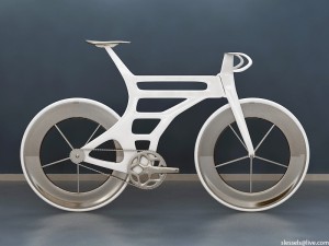
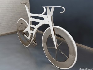
An aerodynamic concept bike

Simon L. (aka Ess) is a designer who is working on an interesting aerodynamic frame design. His blog is chronicling the development of the bike, which features openings in the head and seat tubes to allow air to pass through.

In one of his posts, Ess lists a few of the design details that help to minimize the bike’s frontal area:

1. The frame is hollow with open front and back vents.

2. Sides of the frame are parallel (made possible by placing the back cog on the outside of the frame, which suggests that you can remove the back wheel and keep the chain/sprocket in place!).

3. The headset is split into two (top and bottom).

4. Handlebar stem split into two fins

5. Integrated seat post created from two fins

6. Seat attached to the integrated seat post using a mono-fin

The design is still in the development stage, but I will continue to follow Ess’ blog to see how it progresses. It looks pretty interesting so far.


Bicycle design

Designer Mark Sanders uploads his original Strida bike student thesis

0stridaorig01.jpg

You've seen it in the window of Design Within Reach, or cutting through traffic down Broadway; but now you can take a very different look at the iconic, folding Strida bike.

Mark Sanders, who designed the Strida while he was an Industrial Design Engineering student at London's RCA 25 years ago, has now uploaded his original graduate thesis presenting the original bike. (He's even uploaded his business plan!)

0stridaorig02.jpg

In the presentation, Sanders lets on where some of his inspiration came from:

When folded, the bike can be pushed along on its wheels, which come together to form a long thin package. This folded form was chosen after seeing folding baby-buggies in use, as these fold into long, thin package with wheels at one end, and are used in exactly the same way as the bike (put in car boots, taken into shops, etc.) The baby buggy is one of the most successful folding products.

via treehugger

Bicycle design

Get it right, people, it's "Coroflot" for chrissakes

0minimaldsch01.jpg

I was just reading this article speculating that Microsoft may bring the Courier project back online. To refresh your memory, the Courier was a dual-screen tablet concept that the boys in Redmond had been floating around, but pulled the plug on shortly after the iPad began making waves. (See also: This morning's story on killing the Kin.)

Here's the part of the article I found interesting (boldface mine):

The Microsoft patent document identifies two other "inventors" of the dual display device besides Microsoft: Scott Wilson and Stephen Christopher, both of Chicago. An Internet search traced the two to Coroloft, which is described as a job board for a wide variety of designers, but including industrial designers and product designers. Neither has yet replied to a request for comment. Microsoft again declined to comment today on the patent news.

Wilson has since responded to the author of that article, though I'm surprised said author didn't spell his name "Wislon."

In any case, you can check out Christopher's and Wilson's individual portfolios on Coroflot. The two are accomplished designers that have done projects you'll surely recognize; Wilson was a Global Creative Director at Nike, and Christopher's an ex-Motorola guy. Christopher currently works for Wilson's MINIMAL design studio, which is based in Chicago but has branches in Portland and Milan.

0minimaldsch02.jpg
Core77

iPhone 4: "We're working on it..."

iphone4_arrow.jpg

The iPhone 4 has received it's fair share of criticism (and lawsuits?) due to a design flaw where holding the phone a certain way causes dropped calls and lowered reception strength. Yesterday Steve Jobs supposedly said,"We're working on it..." and today, the "Death Grip" problem is being acknowledged on Apple's site as a "software calculation error."

Our formula, in many instances, mistakenly displays 2 more bars than it should for a given signal strength. Users observing a drop of several bars when they grip their iPhone in a certain way are most likely in an area with very weak signal strength, but they don't know it because we are erroneously displaying 4 or 5 bars. Their big drop in bars is because their high bars were never real in the first place.

Apple goes on to say they used the same formula for past iPhones, but it's only noticeable now because of the new antenna.

Already have an iPhone 4 and want to reduce your Death Grip? You're not alone. People around the web have been hard at work: some havepainted clear nail polish around the phone, others have wrapped tape on the corners, a few have used Sugru, while the most audacious have taken a knife to the ports and modified their SIM cards. I guess desperate times call for desperate measures, but you could just buy a case.

Core77