

 |


Wouldn’t be great to have this re-designed Retractable Tape Cord? Our traditional extension cords usually need to be mounted on the wall/floor to avoid the mess, but using this new design, no more mess. It can lay flat on the ground and is anti-tangle. This electrical extension cord allows user to pull out the desired length and lock it so that it won’t retract. To pull back, just simply press the button on the case. It works just like retractable tape measure. The cord is made with polysiloxane (a silicone polymer), whose properties allow the cord’s thin profile and cause it to lay flat. The hidden plug feature makes it easy to carry in a bag.
Designer : Cheng Ho-Tzu


Robot được cấu tạo từ các thành phần nhựa nhẹ, chỉ nặng 2kg, nâng được một vật 500g. "Vòi voi" hoạt động bằng lực hút và thổi, chuyển động rất linh hoạt. German Future Prize (Giải thưởng Tương lai của Đức) - một trong những giải thưởng danh giá nhất của Đức dành cho thành tựu khoa học đã được tặng cho công trình robot vòi voi của Công ty Festo và Viện công nghệ sản xuất và tự động hoá mang tên Fraunhofer.
Kết cấu này không cấu thành từ các chi tiết kim loại mà cấu tạo từ các thành phần nhựa nhẹ gợi nhớ những khối khí. Người ta dùng lực hút và thổi để điều khiển chuyển động của "vòi voi". Ở cuối "vòi" có gắn thiết bị "đồ gá". Robot vòi voi có thể nhấc vật nặng 500 gr còn trọng lượng của nó thì là 2 kg. Để so sánh hiệu quả của robot vòi voi, người ta cho biết, thông thường, các robot công nghiệp chỉ có thể mang nặng không quá 1 phần 10 trọng lượng của mình.
Theo đại diện nhóm thiết kế, họ tìm cảm hứng cho công trình của mình trong tự nhiên và đã lấy mô hình vòi voi làm hình mẫu cho "cánh tay thứ ba" - khoảng 40.000 cơ bắp của nó cho phép uốn cong cánh tay về mọi phía. Các nhà phát triển đề xuất ứng dụng robot vòi voi trên những dây chuyền sản xuất, trong các bệnh viện và trong mọi tình huống khi con người cần đến "cánh tay thứ ba". |
| Theo PCWorld |
Iterations and iterations! If there’s one thing a tech and design writer cannot possibly ignore or resist, it’s Tron. With this brand freaking new movie Tron: Legacy out now, the folks at Disney have basically a sure shot as far as the internet crowd goes, and for the most part, everyone riding on the wave has their own shot at fifteen minutes of fame. Here’s a designer taking that opportunity to the max with some alternate Light Cycle designs made for your pleasure!
This project is simply an exercise in enjoyment with designer Wallace Campbell following what he sees as the essential elements included in a Light Cycle, bringing unto the world another iteration with super sweet bright lights and blackness, all you could ever want.
A hubless wheel system, light trail, and glowing accent lights are amongst Campbell’s self-imposed rules for the bike. Included also are a set of reality based parameters in place to bring the bike closer to a real world production. Included in this list are a windshield, side view mirrors, ecgonomical seat, and more. There is a faring on the left side of the vehicle but not the right simply in order to show off the turbine style engine.
Designer: Wallace Campbell


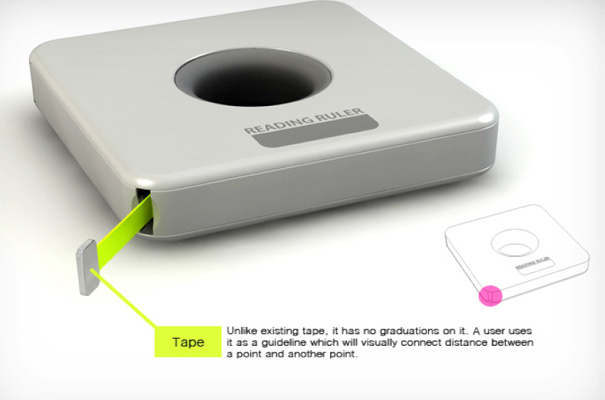
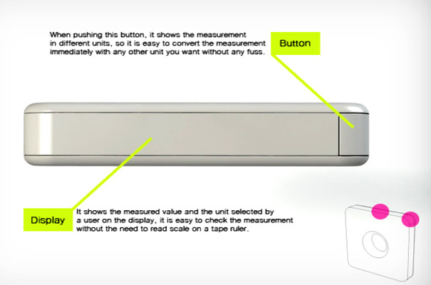
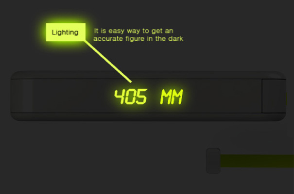
Now this is clever. The Reading Ruler is a tape measurer with a digital display and reads out the units of measurement. It even works in the dark. For the life of me I can’t imagine why we would need to measure anything in the dark unless it’s in the dungeons of Malfoy Mansion, but then we would just summon Doby for help no?


Behold an electric motor vehicle who indeed does fit the mold of “more than meets the eye.” This is no robot though, it’s a compact urban city car, but what’s more is that its rear wheels transform into bikes. Each of these bikes have only a single tire, functioning on the same system as the Segway! The car with the bikes still integrated has a light weight structure, 2 parallel side panels and a bunch of cross panels making the car like a feather yet totally tough.
To separate the bikes from the car, you’ve only to open the rear hood, take the bumper out, set down the stand to keep the car aloft, remove the docking lock, and activate the bike. A couple more features in the car are a solar panel roof, glass panels for side doors, and an overall essence of architecture embedded in the whole structure.
This project is a 2010 Red Dot Design Awards winner!
Designer: Bobin Kil


On its own merits this book deserves the attention of any student of drawing, but it is more than just an inspirational collection of drawings; it is also a memorial to a dear member of the Art Center design community. The drawings are those of Norman j. Schureman, a beloved and talented faculty member at the acclaimed school. Norman tragically died earlier this year and this book aims to preserve his legacy while raising some money for his family.
You can see more of its contents and order it here.


On the inside cover are a series of what this reviewer suspects were abandoned title possibilities in bold white type with strikethroughs, but they could just as easily serve as rules that are meant to be broken, such as "Location, Location, Location," or "It's Not About Persuasion." A few pages further intrepid readers will discover the most irreverent inspiration list we've ever seen including such gems as "Salvador Dali, for his mustache, not his painting," "Franz Kline, for his painting, not his mustache," and "Patrick Swayze, but only for Road House." The book is overstuffed with too many throwaway gags and in jokes to mention in the intro pages alone, so it's worth moving on to the content inside the actual graphic design.

Once we get past the stark cover credits, we finally get to Victore's work. He cut his chops on book covers and the visuals are dynamite. Almost all are photograph or collages with scrawls on top, but the wit and spontaneity that drove them takes precedence over the craft of the line. A few standouts include a military photo with white lines cutting up a soldier like a butchers diagram for Johnny Got His Gun and a stark black cover with white teeth for The Werewolf of Paris..The poster content that follows is irreverent and raw. Explaining that that when he went looking for his posters, they had disappeared, Victore says, "I had made something that people wanted to steal." Well, in this case you have to pay for it, but the sheer volume of creative energy contained in Who Died and Made You Boss is sure to inspire and entertain.


Pro-ID Design by Topwpthemes. Converted By Ha Nam Son , Email: pro.idgroup.vn@gmail.com Or swin9986@gmail.com .