30/3/11
Philips Wins Red Dot Design Award for Jump LED Luminaire

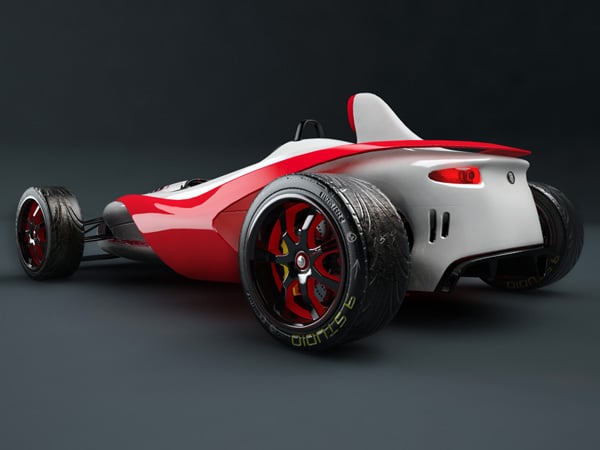
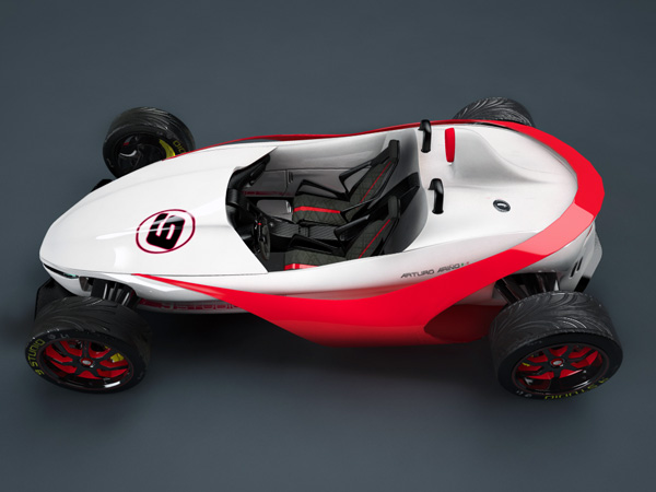
Reptilian Roadster
Long is right, vehicles are getting more and more lifelike! Check out the crocodilian face from the front view of the Reptile and you’ll see what I mean. This race car crosses over to the streets with it’s hybrid 4-pole electric induction/27000CC Wankel engine that develops more than 700HP at 9000 RPMs. Rawr.
Designer: Arturo Arino


Just Pure Water


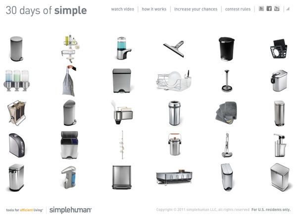
30 Days of Simple, Win simplehuman Products!
There’s design and then there’s smart design. simplehuman falls into the latter. I’ve been a huge fan ever since I decided my daily menial tasks could be more efficient simply by getting “simple.” When objects take up too much space and design isn’t used to improve one’s quality of life, you end up with stressors. simplehuman “gets” it and they’ve launched a new campaign where all of you can get it too – 30 Days of Simple.
It’s an interactive and fun giveaway created to engage you with simplehuman products and have the chance to win prizes! Just watch any of the videos and submit your email address to be eligible. Every day, beginning April 1, someone will win. Don’t sleep on this people. Bookmark the site and tell your friends. Personally I want to win the Sensor Can below.
Learn & Win: 30 days of simple
Core77 Design Awards: 3 Days Left to get the Early Bird Discount...

Enter the Core77 Design Awards by Thursday March 31st and not only will you be putting your work in front of an exciting line-up of judges, you'll also be eligible for the nifty 20% Early Bird discount.
The awards are open to professionals, students and DIYers around the world. We've added several new features to the awards program, not the least of which is the 2.5 minute video testimonial. Since designers are great at showing and telling, the Awards provides them the opportunity to share their "real story"—beyond static jpegs and entry form text (which have been simplified and sharpened up, too). This is your chance to make a personal connection with the jury using a low-tech, honest, look-into-the-webcam piece of documentation. Watch samples of videos made by some of our friends in the industry and see for yourself just how straightforward the video testimonial can be.
So submit your entry and pay by Thursday March 31st for the Early Bird discount. Click here to get started.
More Great Concept Work from Mac Funamizu: The Zimmer Phone, the Peel Notifier
It still rankles me when I think of the ignorant blogger who months ago insisted Apple had "reached the limits of industrial design" with the iPhone 4, his idiotic assertion being that Cupertino's glass rectangle could sustain no further modifications.
What a tool.
Case in point, check out Mac Funamizu's latest concept phone, which manages to breathe life into a perfect little rectangle by the means of some subtle curves in all the right places. (For the record, Funamizu's design is not branded "iPhone-" anything, it's just a concept design of his called the Zimmer.)
I want to touch this thing so bad it pains me to watch the animation:
Mobile Phone Sketch: Zimmer from Mac Funamizu on Vimeo.
Japan-based Funamizu (who is fine post-earthquake, by the way, though in an area where goods are being rationed) never ceases to amaze us with his clever concept work. Another of his conceptual objects I'd like to own is his Peel Moving Notifier Concept.

It's a standalone clock that wirelessly syncs with your computer. When it's time to give you an alert, a screen on one of the faces peels backwards to reveal a message/e-mail alert/reminder, et cetera, with the amount of peeling it does correlating with the urgency of the message.

"30 Days of Simple" Promo: Win Free Simplehuman Products
I love the stuff put out by Simplehuman, that purveyor of useful stainless steel objects. And now they're running a promotional where 30 of you (or hopefully, 29 of you and one of me) can win some of their product.
The 30 Days of Simple website has a simple premise: Click on one of their objects, watch a micro-video about it, then enter your e-mail address to be entered in a drawing for that object. Get lucky and you can win like Charlie Sheen.
Anyone can enter (even lowly installation designers) and as the name implies, the promo will run for 30 days. They start picking winners—one each day—on Friday, but the site is live and waiting for entries right now. And in the best traditions of viral marketing, the campaign gives you a second chance to win if you can infect a friend.
Autism Connects Challenge: Get Your Entries In!!
Just a quick reminder to all students to get your entries in TODAY for ourAutism Connects student design challenge! Our distinguished panel of judges, which includes Yves Behar (fuseproject), Lisa Strausfeld (Pentagram), Richard Seymour (Seymourpowell) and our own Allan Chochinov, is eagerly awaiting your entries. Don't miss this opportunity to help individuals with Autism Spectrum Disorder (ASD) better connect with the world around them through a well-designed communication solution.
The jury will award a grand prize of $5,000 to one individual or team. In addition, Autism Speaks will award creators (or one representative in the case of a team entry) of the top three designs a $1,000 stipend and registration fees to attend the 2011 International Meeting for Autism Research, to be held May 12 to 14, 2011 in San Diego, CA, where they will be invited to present their design concept.
COMPETITION CLOSES TOMORROW, NOON EST—Wednesday, MARCH 30th!!
Book Review: Usefulness in Small Things, by Kim Colin and Sam Hecht
"Each Under a Fiver item is a testament to an un-global culture, a testament to local needs and interests. Communities around the world continue to require things that serve their local needs, and often design plays little to no part at all."
In Usefulness in Small Things, Industrial Facility's Kim Colin and Sam Hecht share their "Under a Fiver" collection, first presented at London's Design Museum alongside "Some Recent Projects," an exhibit of the firm's own work. The premise of the collection is simple. As Hecht puts it in his introduction, "As I continued to travel, I made sure to wander through any local hardware stores, pharmacies or supermarkets I came across, finding low-cost objects (all are under five pounds) that told me something about where I was." The resulting array is a delightful antidote to the image-based work so popular on the Internet, a real force in the decline of attention paid to the experiential elements of objects and spaces.

Hecht writes, "The look is commanding too big a role. The limitation with this way of designing, if it continues, is that there is a whole world of situations, functions, and activities that gradually become forgotten." This book focuses on those situations, functions and activities as a driver for why an object was acquired in the first place. The collection is not about being ordinary, unlike Jasper Morrison's and Naoto Fukusawa's similar (and now outrageously expensive) publication Super Normal. Instead, it explicitly favors objects that are locally-specific, materially rich and formally sophisticated even in their simplicity. Hecht and Colin, in accompanying texts, reveal the many ways that these objects transcend function via function.
The book opens with a terracotta light switch found in Italy, striking in its close resemblance to a flower pot and its unconventional shape. Hecht explains that the material choice is "not born out of an aesthetic desire" but a practical one: ceramic is an effective insulator against electric current. Another terracotta object, a skin scrub found in the UK, becomes poetic by explanation: "It's wonderful when you see one material used uniformly throughout an object, which, in this case, is held by the skin of the hand, to remove the skin of the foot."

Items are divided into categories: Care, Modified, Duality, Straightforwards, and Situation. In "Care," the objects exhibit a high quality of materiality or construction. "Modified" items have been changed slightly from their original state to support a new function—a toothbrush head has been flipped on its side to make a tongue brush, most likely using existing tooling. "Duality" groups objects that combine multiple functions; a favorite is the not altogether effective spray bottle/watering can. "Straightforward" celebrates logic, with to-the-point packaging like a tomato juice can that is, more or less, also a tomato. Finally, "Situation" investigates products created for very specific uses, from pipe painting to falafel making.


Instead of aggregating designer work with a curatorial reach that is wide but shallow, a familiar tactic in design publishing, Usefulness in Small Things expresses the values, experience and sensibility of two celebrated practitioners who talk us through the objects that they learn from. It is the best sort of design book, a volume of original information and insight garnered from real world experiences. In this author's opinion, it's well worth the $29.95 (or $19.97 on beloved Amazon).
Finally, the review can't conclude without a nod to Rizzoli's apt choice of graphic designer: Graphic Thought Facility, who did an excellent job bringing clarity and beauty to the ideas and images of Industrial Facility.
Usefulness in Small Things will be released on April 19, 2011.


