11/1/11

20 Questions with Benjamin Hubert

We met Benjamin Hubert at last year’s Electrolux Design Lab event and although familiar with his work, came away with even more respect. Born in 1984, Benjamin studied ID at Loughborough University graduating in 2006. A year later he founded his own studio that includes a diverse range of furniture and lighting products. He’s laid back and has an awesome sense of humor so we decided to play 20 questions.

Designer: Benjamin Hubert

Benjamin Hubert, what do your friends and family call you?

Ben….I have a university nickname some of my friends call me but I’m not telling you that.

Who do you admire?

My family, my girlfriend.

If you weren’t an industrial designer, what would you be doing?

Maybe an artist but I like the idea of being a chef, I love food.

You have your own studio, why go solo?

To have control of the whole process.

What’s your favorite color and why?

Different colours work best in different situations.

What are you most proud of?

Forming my own studio and making it into a working business.

What was your most recent moment of inspiration?

A trip to Marrakech.

If you weren’t Benjamin Hubert, which other industrial designer would you be?

I wouldn’t be another industrial designer.

New project at hand – do you plunge headlong or move with control and caution?

We have lots of new projects on the go for launch in 2011 and 2012, it’s a combination of planning (caution) and going headlong with a vision.

Something about you most people wouldn’t expect?

I worked for 4 large industrial design consultancies before and whilst setting up my studio.

Do you ask for critique during work in progress or wait for the reveal?

Yes lots of critique throughout the process is healthy.

Your ultimate goal?

Happiness.

Where would you be if you could pick up and go right now?

Tibet.

What animal would you be?

A shark.

Strangest question you were ever asked?

Some of the questions on this interview…

Are you a good dancer?

I think I am when I have had lots to drink.

Can you sing well?

NO!

Favorite quote?

Don’t have one.

Favorite number?

Still don’t have one.

Sage advice in seven words or less.

Never give up.

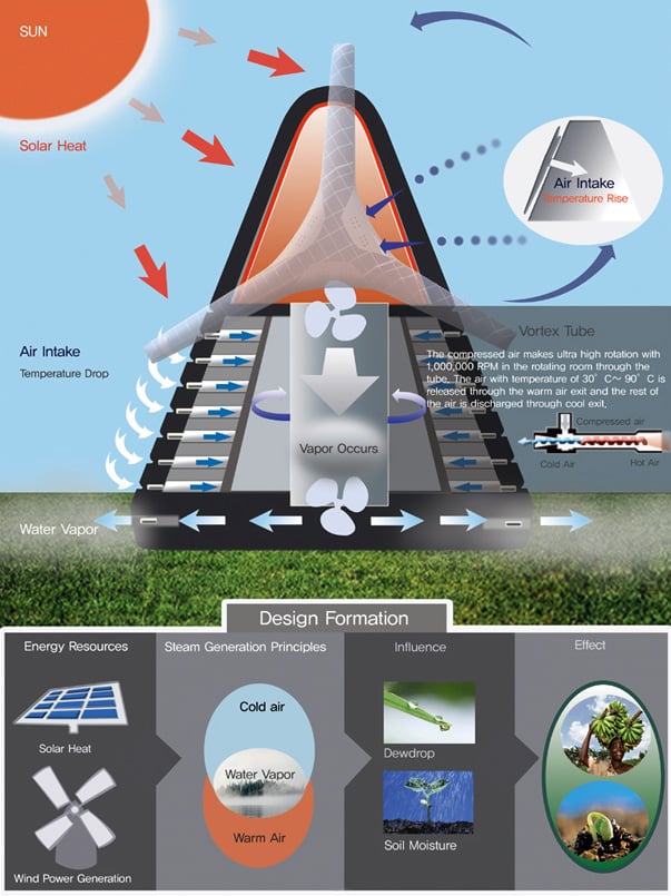
The Water Vapor Project

This year’s IIDA has some pretty interesting entries. For example the Water Vapor Project is an attempt to hydrate the parched desert landscape of Africa. It proposes to build an environment where greenery thrives thanks to the basic principles of water vapor. Hat tip Designboom!

Designers: Sangwook Park, Sinjeong Lee, Hoyoung Lee & Hyeonju Jo

The supplier becoming the master? Johnson Controls unveils their own concept car

0jcie3001.jpg
0jcie3002.jpg

Johnson Controls, formerly a supplier to the auto industry, is taking a bold step forward with their ie:3 concept car, unveiled at the North American International Auto Show.

0jcie3003.jpg
0jcie3004.jpg
0jcie3005.jpg

The car is powered by enough of JC's lithium-ion battery packs to enable a 100-mile range, and the under-floor design provides both a flat floor and plenty of storage space with those flip-up seats; the front passenger side, for instance, can reportedly fit a suitcase (though getting it in and out should be interesting). Overhead LED lighting, recycleable seat materials and an honest-to-God standard plug for accessories round out the car.

Johnson Controls says the ie:3 will be production-ready by 2015.

Book review: Victore or, Who Died and Made You Boss.

victore_review_01.jpg


James Victore's new monograph is so slick that a stranger on the subway asked us what we were reading because he "needed a new book." The design strikes such a careful balance between craft and irreverence that has the same appeal as the cool kid in school that never followed the rules but still graduated on time.

The matte black pages provide a striking contrast to a typically bound book, even when closed, and the cover painting sandwiches those uncommon pages between a carefully defaced oil painting festooned with Victore's trademark hand illustrations (scrawled painted words and a Van Dyke goatee) combined with a stark typeface arrangement. The cover itself actually forms a fold-out of the painting that can serve as a poster, Victore's stock and trade. From the cover on in, the monograph is just as boisterous and freewheeling an exploration of the bounds of graphic design as James Victore's career has been.

victore_review_09.jpg

On the inside cover are a series of what this reviewer suspects were abandoned title possibilities in bold white type with strikethroughs, but they could just as easily serve as rules that are meant to be broken, such as "Location, Location, Location," or "It's Not About Persuasion." A few pages further intrepid readers will discover the most irreverent inspiration list we've ever seen including such gems as "Salvador Dali, for his mustache, not his painting," "Franz Kline, for his painting, not his mustache," and "Patrick Swayze, but only for Road House." The book is overstuffed with too many throwaway gags and in jokes to mention in the intro pages alone, so it's worth moving on to the content inside the actual graphic design.

victore_review_02.jpg

Once we get past the stark cover credits, we finally get to Victore's work. He cut his chops on book covers and the visuals are dynamite. Almost all are photograph or collages with scrawls on top, but the wit and spontaneity that drove them takes precedence over the craft of the line. A few standouts include a military photo with white lines cutting up a soldier like a butchers diagram for Johnny Got His Gun and a stark black cover with white teeth for The Werewolf of Paris..The poster content that follows is irreverent and raw. Explaining that that when he went looking for his posters, they had disappeared, Victore says, "I had made something that people wanted to steal." Well, in this case you have to pay for it, but the sheer volume of creative energy contained in Who Died and Made You Boss is sure to inspire and entertain.


victore_review_03.jpg

victore_review_04.jpg
victore_review_05.jpg
victore_review_06.jpg
victore_review_07.jpg
victore_review_08.jpg

Book Review: Predictable Magic: Unleash the Power of Design Strategy to Transform Your Business, by Deepa Prahalad and Ravi Sawhney

predicatble_magic_01.jpg

The Predictable Magic to which Prahalad and Sawhney refer in their recent book has been given the moniker of Psycho-Aesthetics, and Ravi's firm RKS has applied it successfully to a range of products over his career as a consultant. What they're getting at is not what is commonly recognized as aesthetics (the visual sense). Instead what looks are to the eye, Psycho-Aesthetics are to the soul or the psyche. In the Afterward they provide the clearest description of their end goal: "It's not how you feel about the design or the experience; it's how it makes you feel about yourself."


Between the Preface and the Afterward, however, the reader needs to learn just how to make that happen. The core of the book serves to create a framework for the repeatable creation of products that connect with the end user emotionally. The book is structured in chapters that reflect each step of the process by the acronym EMPOWER. While it's not worth belaboring what each letter stands for, some chapters are worthy of describing in detail. When they describe "Mapping the future" they present a quadrant chart with interactivity along the x-axis and basic functionality to dynamic empowerment along the y-axis. The map can function like any competitive landscape (i.e. the company would be well served to attack areas where their competitors are not) but it's the upper right quadrant that's the sweet spot. Motorola's RAZR was gorgeous but had a limited feature set and the Blackberry was so functional that it's widely used even with a large and heavy form factor. Only the iPhone in the upper right quadrant managed to engender so much adoration that people use itdespite the call quality.

predicatble_magic_02.jpg

Predictable Magic introduces the psycho aesthetics framework through the phone example above at the "M" but does not bring it to it's resolution until the "O" of EMPOWER. Each example is carefully shepherded through the book to give the reader a strong sense of continuity. Once they've described how Psycho-Aesthetics can be used to position a company, the authors reiterates each of the case studies they've shown thus far as a progression from on quadrant in the Psycho-Aesthetics map into another that serves the company better.

Part II involves the implementation of the aforementioned strategies in ways that engage the customer base. The general thesis that a satisfied customer base will result in a financially rewarded company is attacked from an emotional standpoint. A case study of the MiniMed insulin pump demonstrates just how important the feelings of the customer can be. Simply by adopting the form factor of a socially acceptable pager, MiniMed was able to let their customers feel socially unencumbered by their diabetes. Once the usage of a product can be turned into an emotional experience, less focus is required by the sales force because the customer base itself is evangelizing. In the era of social networking, some of these discoveries now seem evident, but RKS has been doing it for decades. Industrial designers on the cusp of the new social era would be well served to pay attention.

predicatble_magic_03.jpg

Nendo "dancing squares" at Art Stage Singapore

shelf_002.jpg

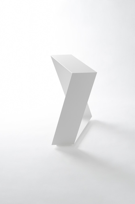
Prolific Japanese design firm Nendo will be exhibiting a new collection of interior objects at Art Stage Singapore, an art and design show debuting for the Asia Pacific market. Nendo's "dancing squares" series assembles square planes to create a sense of motion in every day objects.

One part of the bookshelf is frozen in its cascade of tumbling shelves, creating variety in the way books can be stacked. The stool's twist endows it with visual play. Lamps roll about but are stable, thank to their planes, and cast light in different directions. The table leans as though falling away, but maintains its function as a table, and makes objects placed on it seem to sink into its folds and sways. The different 'movements' make balance and unbalance overlap, as though we are watching the planes themselves dance.

Art Stage Singapore debuts January 12th-16th at the Marina Bay Sands.

lamp_004.jpg

stool_003.jpg
table_002.jpg
no boundaries ad.jpg

Clever dispenser design combines benefits of liquid and bar soap

0soapflakes003.jpg

Eindhoven grad Nathalie Stampfli's brilliant Soap Flakes dispensers use bar soap while taking cues from cheese graters and peppermills. As you can see in the photos, the user inserts a bar into the devices--one design is wall-mounted, the other handheld--and it then dispenses soap flakes.

0soapflakes004.jpg

Why make something like this? As Stampfli explains,

Today, most of the soap we use is liquid soap, which contains a lot of water. Block soap instead is more concentrated and therefore has some ecological benefits: You don't transport unnecessary water around. In place of plastic bottles you can simply use paper for packaging. The solid blocks can easily be piled and allow a greater space efficiency in a truck.

But what about the usage of soap bars? I don't like the weird slippery feeling when I use them. It gives me goose bumps. And under the shower, it always slides out of your fingers. Hand soap also often gets dirty and accumulates bacteria when more than one person is using it.

0soapflakes005.jpg

via kottke