25/6/10

Shimano STEPS group for e-bikes

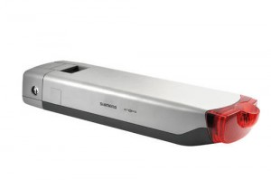
The Shimano Total Electric Power System, aka STEPS, is due to be launched at Eurobike in September. Bike Radar has a first look at the group, which includes a 250W electric motor and a 24V/4.0Ah lithium-ion battery that can be charged by regenerative braking. The 8-speed internally geared hub is operated by electronic shift buttons, and buttons on the brake levers operate the front a rear lights. I particularly like the way the rear light is integrated into the rear rack mounted battery pack…nice design detail.

There are certainly more powerful electric motors for bikes out there, but that doesn’t seem to be a concern for Shimano. According to a Bike World Europe article, “what sets STEPS apart from many other electric bike systems is a basic principle in its development. According to Shimano, that principle is that first and foremost, an e-Bike has to be a bicycle.”

I have been saying for a while that e-bikes are going to explode as a product category (in the U.S.) at some point, and this component group by Shimano may help to speed that growth along. I’m looking forward to seeing new bikes next year specified with this group.

Bicycle Design

African Bicycle Design Contest

Cycling out of Poverty is a non-profit foundation that raises money for projects that allow Africans to improve their daily lives through the use of bicycles.

Currently, they are running an African Bicycle Design Contest at Wiki-Bike.com. On the website, you can read about the competition and you can upload your own ideas for durable and sustainable bicycles for Africa.

The deadline for the contest is 5 pm on Thursday, September 30th, 2010. At that point, a professional jury will judge all contributions and select 5 winning designs. Those five winners will be awarded with a design team who will develop the designs / ideas into working prototypes. The design team that delivers the best prototype will win a 10-day trip to Kenya to train and assist a Kenyan team in producing this bicycle. For a little background on the African Bicycle Design project, check out this video featuring a team of four industrial design students from the Delft University of Technology who worked with people in Kenyan last year to develop a street vending bicycle.

I am honored and excited to be serving as one of the jurors for the 2010 competition. It is certainly my hope that we will have many great ideas to choose from, so I encourage all of you to go to the site, register, and submit your ideas for a bike to help the people of Africa. Who knows…maybe your concept will be the one that really makes a difference.

Bicycle Design

Bicycling Science book giveaway

Looking back at the reports for the Bicycle Design Amazon store, it is clear that the book Bicycling Science is the best seller of the items I have listed. I am glad to see that, because it is definitely the first book that I would recommend to anyone interested in the design and engineering of bicycles (followed by Archibald Sharpe’s 1896 Bicycles and Tricycles). Originally published in 1982 by The MIT Press, Bicycling Science by Frank Rowland Whitt and David Gordon Wilson is now in its 3rd edition. Richard Ballantine called it, “the ultimate fundamentals book in cycle science” and went on to say, “for anyone with a deep interest in cycling science and human power, this book is simply essential.”

Cleaning my office this week, I found an extra copy of the book (the 2nd edition printed in 1988). Since I don’t really need two copies, I am going to give it away one to a Bicycle Design reader. All you have to do is follow Bicycle Design on Twitter or like theFacebook page then just mention this post in either place. I will pick a random winner one week from today (Thursday, July 1st at 12:00pm EST) and ship my extra copy of the book to that person. Some of you may be thinking, “great…a used 20 year old paperback. What is that, like a 2 dollar value?” Well, don’t worry, I found a couple other old (um…I mean classic) books, during my cleanup, so I’ll throw in at least one other book as well. Sure it is not as good as a free bike, but I do think the books will interest any of you who read this blog on a regular basis. Good luck!

Bicycle Design

Book Review: Vending Machines: Coined Consumerism, by Christopher Salyers

vending_machines_book_01.jpg

Despite the erudite and thoughtful historical introduction and the literally hundreds of context-rich photos of machines in-situ, fate, of course, would have the Core77 team first open Christopher Salyers new book to the full-bleed photo of a Japanese "used" panty vending machine. Attacking that subject with the academic rigor it deserves (?), Vending Machines: Coined Consumerism notes that Japanese law requires licensing for the sale of used goods, so a mango scent is substituted for the real thing. While the sale of used panties in a vending machine might be due primarily to cultural factors, what can't be denied is that Japan's demographic trends (urban population density and an aging populace coupled with technological sophistication and relative affluence) point toward where most First World countries may be headed in the near-future. So while cosplay costumes (Japan - page 17), gold coins (Germany - page 26) and an automated hair straightener (Scotland - page 30) may not be reaching the masses anytime soon, things like beach-adjacent board shorts dispensers (US - page 32) and cloudburst-ready umbrella dispensers (Britain - page 31) have a certain logic. Just don't expect walking vending machine robots (Japan, of course - page 40-41) to take over the world quite yet.

vending_machines_book_03.jpg
vending_machines_book_02.jpg
vending_machines_book_06.jpg


Salyers breaks the vending machines into several categories: "Weird World," "Japan is the Future," "Capsules Candies & Claws," "Retro Vending," and "In Soda We Trust." Each section is separated by essay content, including a rather thorough historical overview in the introduction. From there, the Weird World section is by far the most fascinating, with all of the quirky products listed above coming from that section. Photos vary from glossy professional shots of a "car vending machine booth" to the author's own more candid travel shots. Some of them, such as a pizza vending machine that purports to knead its own dough and make the pizza from scratch in 3 minutes promise a future that might actually be preferable to Sbarros and a heat-lamp. Most of the jobs that these vending machines replace aren't exactly jobs people love, and for some products (like the umbrellas), the vending machine fulfils its purpose during the rain, but won't be bored or dissatisfied on sunny days.

vending_machines_book_05.jpg

In its last sections, however, Vending Machines turns backward looking. The section on Capsules & Claws highlights curious products to be dispensed rather than fascinating mechanics. Retro vending highlights decaying lipstick dispensers and other oddities, with unbelievably deflated prices that hearken back to bygone days. Finally, the "In Soda We Trust" section documents the ubiquitous soda machine across a variety of cultures and locations. While the product is familiar, the form factors vary from utilitarian (Europe), garish (US), and busy (Japan).

vending_machines_book_04.jpg

Overall, Coined Consumerism is an odd book documenting a strange cross section of business. While the early sections present an almost voyeuristic insight into curious human behavior across cultures, the latter sections display a more kitsch sensibility or a Walker Evans style man-on-the-street journalism. From an industrial design standpoint, more emphasis on the mechanics and the early sections would have been greatly appreciated, but as a coffee table book of ephemera Salyers probably got the balance just about right.


vending_machines_book_07.jpg
Core77

Core77's iPhone 4 first impressions

0iphone4fi01.jpg
0iphone4fi02.jpg

Years ago I was employed as an urban dating columnist. (What can I say, it was the dot-com boom.) For one installment I took a NYC-based dating workshop called the RelationShop. Internet dating was just picking up at the time, and the workshop instructor/relationship guru gave us all this piece of advice for navigating dating websites: "Don't put up an overly flattering picture of yourself," he warned. "If you do, your blind date will have that image of you in their head; and when they arrive to the first date and find you don't look as advertised, their initial reaction is disappointment. And disappointment is the worst possible way to start a date, never mind a relationship."

I'm here to tell you the new iPhone 4 is the opposite of a so-so date with an amazing picture. Photographs simply do not do this thing justice. And I'm not talking about the leaked Gizmodo shots, I mean Apple's highest-quality PR hero shots. They make the thing look decent, but when you see it in person, in 3D, and hold it in your hands, you cannot help but be in absolute awe of the styling, build quality, and fine detailing.

The stainless steel band that runs around the phone, the ridiculously tight fit-and-finish of the Micro SIM card cover (the tolerance looks to be in microns), the fine grill covering the earpiece and speakers that looks like it's made with nanotechnology, the subtle, circular bezel around the front-facing camera--these are all details that say the designer or design team gives a damn. They give a serious damn. To a regular consumer this looks like an elegant device. To an industrial designer this looks like Saturdays at work, missed birthdays, and going home late at night but then turning your car around in the parking lot and heading back into the office because you had another idea. Someone or some team slaved over this thing and it shows.

One example of the detailing I was struck by is the edges. Seen in profile, the stainless band is not the same width as the phone; it's slightly narrower. And seen in front view, the glass is slightly narrower all around than the stainless band. So what you have running around both the front and back edges of the phone is a little step, if you can imagine the cross-section, the cavity between two corners. Whether by design or accident--I'm going to guess it's the former--this circumferential void provides a modicum of grip. Your finger hits, on a micro level, two edges rather than one and registers the phone in your hand. Both stainless steel and glass are inherently slippery materials, and if the corners met perfectly, picking the phone up would be difficult. The stepped edges ameliorate this.

0iphone4fi03.jpg

If that's not enough grip for you, Apple also offers a "Bumper," a rubber/plastic edge that goes around the edges. One nice detail about the bumper is that it has integrated silver metal-look buttons that go over the phone's volume and on/off buttons. Overall the bumper provides greater grip and is easy to pop on, but I dislike it for several reasons: One, it covers up the stainless steel band, which I like to see; two, it recesses the "mute" button so far that you can only manipulate it by concentrating and using your fingernail; and three, perhaps most bewilderingly, the iPhone does not fit in the (new for iPhone 4) dock with the bumper on! The design detail lavished on the iPhone itself does not appear to have been evenly distributed to the Bumper.

0iphone4fi04.jpg

Same goes for the new dock, which is smaller than the old but has the same ergonomic problem: Removing the iPhone from its dock is impossible to do one-handed. The dock sticks to the phone, so one hand must grab the phone while the other reaches behind it to press the back of the dock against the desk while you lift it. I don't think I've ever read another reviewer mention this, and I'm prepared to be criticized as being the only person this bothers; but I bring it up because I see Apple as a company that considers every element of the entire user experience, and I find it curious that the docking experience is not as considered as all of the other things they do.

Now, back to the phone itself. After reading some technical arguments online about the Retina Display, I was prepared for it to be underwhelming. My fears were unfounded. The Retina Display is an order of magnitude better than the older iPhone's display. I never thought the old iPhone screen was bad, it's just that the RD is so much freakin' crisper, in everything from little tiny thumbnails to full-screen photos, that the side-by-side difference is nothing short of astonishing. I know that sounds like hyperbole, but folks, you have to see it for yourself--I tried photographing old-vs.-new-side-by-side but I don't have a camera with a good enough lense to make out the fine detail. Colors have more pop, edges have more definition, and in comparison, perfectly in-focus photos I had on the old iPhone look blurry and out of focus compared to the way they look on the iPhone 4.

This also goes for reading webpages in Safari. When viewing fine text, at points it's difficult to believe, aside from the luminance, that what you're looking at is electronic and not printed on paper. The crispness you've read about has not been exaggerated.

In terms of speed, the iPhone 4 is noticeably much faster. Push a button and you get the response instantly. This was most noticeable when I was taking side-by-side photos with the old and new iPhones (it should be noted, though, that my older model is a 3G); hit the shutter on the old one and there's some lag. Hit the new one and it's lightning-quick.

Here are some old-vs.-new iPhone camera photos (older up top) of this morning's line at the Apple Store next to the Core77 offices:

0iphone4fi05.jpg
0iphone4fi06.jpg

Later I'll try shooting some video to show you.

Well folks, this was just a first-impressions post as I've only had the phone for a few hours. I haven't had a chance to try the Facetime feature yet, as I've got to find someone else who's got an iPhone 4. I guess I could use the front-facing camera to do something else, like...take a photo of myself for a dating website. Just gotta make sure I catch the least flattering angle.

Core77
The Living Principles for Design: A new online community for sustainable design

livingprinciples_logo_b.gif

Today marks the official launch of the Living Principles for Design, a new online portal "intended to give the creative community a place to share and showcase best practices, tools, stories and ideas for enabling sustainable action, popularizing the efforts of those who use design thinking to affect positive cultural change."

Originally conceived through AIGA—the professional association for design—The Living Principles will provide a nexus for people and thought, and grounds itself in a roadmap, or framework, of four considerations: Environment, People, Economy, and Culture

The Living Principles framework aims to clarify the multiple, interrelated dimensions of sustainability and guide purposeful action in everyday design and business practice. Drawing from decades of collective wisdom, theory and results, the framework weaves environmental, social, economic and cultural sustainability into an actionable, integrated approach that can be consistently communicated to designers, business leaders, educators and the public.

livingprinciples_map_a.gif

The initiative will depend on the creative contributions of community participants from every discipline, and members are invited to address topics in sustainability through the posting of articles, suggestions for best practices, case studies, opinion pieces, reviews, podcasts, videos, and more.

livingprinciples_home_short_a.jpg

Presented by Mohawk Fine Papers, the Living Principles has received the endorsement of many global organizations, including Cumulus, Design Ignites Change, Design Management Institute (DMI), GreenBlue, Industrial Designers Society of America (IDSA), o2 Global Network, Organic Exchange, Society for Environmental Graphic Design (SEGD), Icograda,The Society of Graphic Designers of Canada (GDC) and Winterhouse Institute. Core77 is proud to be a media sponsor of the initiative, and we'll be sharing content with the site and posting some of our favorite Living Principles' picks, so stay tuned to both sites for more.

If you'd like to join the Living Principles' community, all you have to do issign up here.

Core77

Vac from the Sea: Electrolux's quest to collect the ocean's plastic debris and turn it into vacuums

vacsea-logo.jpg

Electrolux has just embarked on a quest: to collect the debris from plastic islands in the ocean and turn them into a line of 6 vacuum cleaners, each representing one of the following bodies of water: the Pacific, the Atlantic, the Indian Ocean, the Mediterranean, the Baltic Sea, and the North Sea. The quest intends to bring attention to the issue of plastic pollution in the ocean (see the Great Pacific Garbage Patch) and to combat the scarcity of recycled plastics needed to make home appliances. The initiative is entitled Vac from the Sea.

From Hans Stråberg, the President and CEO of Electrolux:

Our oceans are filled with plastic waste. Yet on land, there is a shortage of recycled plastic. The supply of sustainable raw material, such as recycled plastic, is crucial for making sustainable appliances, and assisting consumers in making their homes greener. I therefore hope people will join us in raising awareness about the threat plastic poses to marine habitats, and the urgent need for taking better care of the plastic that already exists.
vacsea-sketch1.jpg

Maybe you're wondering what this vac might look like—after all the plastic is melted down would it transform into some kind of muddy gray or brown? The Electrolux design team has done a preliminary concept sketch representing how these plastic might be treated, and we love it: the scavenged plastic will be pressed/melted together, kind of like those little plastic beads kids iron together into pixelated shapes, but better.
It remains to be seen what will happen when they begin working with the material, but we hope it stays multi-colored.

vacsea-debris.jpg

The debris will be collected by whatever means possible: diving, fishing or scavenging. Anyone interested in getting involved or following the endeavor should check the Vac from the Sea website.

For more info, watch the video just after the jump.

Core77

Jurors have a hard time (in a good way) determining 2010 International Design Excellence Awards top prize

0onedown.jpg

That there is the proverbial better mousetrap. The OneDown mousetrap's ingenious design is simple to "set," with no danger of snapping your fingers in anything; it clearly indicates when it's captured something (the weight of an entering mouse rolls it from horizontal to vertical); and there's no mess, as it doesn't kill the mouse, just traps it so you can safely deposit the little critter outside, or maybe down the hall near your annoying neighbor's apartment.

As brilliant as it is, the OneDown is just one of the 38 Gold Medal winners of the 2010 International Design Excellence Awards, and Fast Company's got an article up covering the final selection process.

The best World Cup matches are not the Portugal-North Korea blowouts, but the hotly contested ones, like U.S.-Algeria. Similarly, we love it when design competitions and awards have no easily clear-cut winners because the quality of the entrants are so high. So we were thrilled to read the jurors agonized over which medalist would snag the coveted Best in Show title:

The jurors are hypersensitive about the signal their choice will send to the larger design community. Jury chief John Barratt, CEO of product-development firm Teague, insists that the winner be something that people throughout the industry "could be proud of vicariously." He also reminds the panel, "This award is the bellwether of where the industry is and where it's going."

Read all about it, and see more of the medalists, here.

Core77

This is how you do a pop-up community! ESPN's Match Truck delivers World Cup matches and world-class street food

0espnmt01.jpg
0espnmt02.jpg

At 7am this morning a yellow delivery truck trundled through Manhattan carrying, along with raw food ingredients, a rather unusual payload: The United States national soccer team. The Algerians too.

Not the actual teams of course, but by 9am, when the specially-designed LCD television was rigged up atop the truck, the truck made good on its promise of delivering the match between these teams to the sidewalks of New York City. Free of charge.

0espnmt03.jpg

Since last week the ESPN Match Truck has been staking out select spots in Manhattan on every World Cup game day, fully deployed and ready to go by 9am. A support crew hoists a custom 55" monitor, encased a specially-made weatherproof and glare-free housing, atop the truck while the technical director rigs up a DirecTV satellite dish and receiver. Outdoor speakers are connected to make the commentators heard, and then bypassing New Yorkers suddenly have a compelling reason to linger.

0espnmt04.jpg

But the matches are only half the story; the other half is the food. The truck's graphics are hand-painted, like an original L.A. taco truck, which is probably not accidental--ESPN and the Civic Entertainment Group, who helps manage the truck, partnered with L.A.'s legendary Kogi BBQ Truck to devise an international menu of snacks inspired by the nations in the tournament. For a few bucks fans can chow down on Tortilla Espanola, Lamb Gyros, Kogi Ketchup Sliders, Yaki Mandoo Dumpings, and others. The food itself is awesome (I can vouch) and credibility, along with food-porn photos, has been conferred and displayed by food-blog write-ups atAlways Hungry NY, Esquire's Eat Like a Man and Deep End Dining.

0espnmt05.jpg

"The trend of high-end street food--'vendrification'--is gaining more popularity around the country," explains Seth Ader, ESPN's Senior Director of Sports Marketing. "And given the daytime hours when World Cup matches are being shown in the U.S., we wanted to offer our fans an opportunity to see matches that they would otherwise miss while commuting or running errands. The association with Kogi gave us instant credibility with the street food crowd, while the ESPN brand and the TV setup delivers a great World Cup viewing experience."

I stopped by the truck yesterday and caught part of the Spain/Honduras match, where a small crowd had gathered in Foley Square. There are other World Cup pop-up communities in New York, like the Play Beautiful space in NoLita and Puma City at the Seaport; both of those have strong retail components, but what I liked about the ESPN truck is that there was absolutely no air of hucksterism about it. No one tried to sell me anything. One guy in an ESPN shirt was handing out flyers which I assumed would be selling cable packages, but instead they were just match schedules. I even spotted ESPN's Seth Ader by the truck--hanging out and watching the game with the rest of us. It felt like it was all about the matches, with optional, tasty snacks at street-food prices.

In Kogi BBQ tradition, the truck tweets its daily locations here. (There's also an L.A. counterpart, tweeting here.) I was unable to make this morning's U.S.A./Algeria match up in midtown, where the truck was mobbed by roughly 400 bypassers-turned-viewers, but I called CEG Event Coordinator Luke Abbott, who was manning the truck, to ask him what the mood was like after Donovan scored the 91st-minute game-changer. Abbott picked his words carefully: "It was...absolutely insane."

0espnmt06.jpg

[image credit: Timothy A. Clary/AFP/Getty Images]

Core77