1/3/11

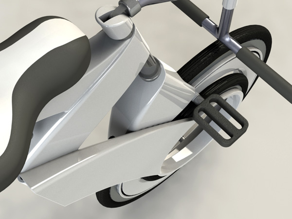
If Obama Had a Scooter

In response to growing urban environments, the Fuse electric scooter aims to provide quick, sleek transportation while being spatially efficient. This single-person concept reduces the size of the already compact scooter by auto-collapsing vertically in park mode. For public parking the Fuse charges via electromagnetic induction on it’s shared smart-charging mat. Other highlights of the Fuse include a touch-screen display, integrated GPS, and open wireless technology. Not just for Obama, but any young urban professional.

Designer: Lance Cassidy

Saved by the Glow

The scene is a fire in a highrise and the ensuing chaos can make it difficult for people to locate exits. In such scenarios, the Light Emitting Door could mean the difference between life or death. A bright LED located at the foot of the door directs people to a hinged shutter, kinda like a doggy door. I think its a neat idea and worth installing.

Light Emitting Door is a 2010 Red Dot Concept Award winning design.

Designer: Hsu Chih-Jung

10 Paradigm Shifting Battery Concepts

The quest to make batteries last longer has led to some interesting concepts. The focus haa narrowed mainly to two areas: capacity and recharge. Here is a look at 10 paradigm shifting battery concepts, many with some added whacky functionality.

As the name suggests, the Wind Up Battery includes a hand crank to rev it up with juice. Just in case you don’t have the electric point in handy to do the honors.

9) Pushup Mint Battery #2 by mintselect @ mintpass

Mintpass is know for their realistic life form products and this cute Pushup Mint Battery #2 is another fine example. It recharges via a USB port or with winding.

8 ) Hungry Batteries by Mac Funamizu

As their power dwindles, the Hungry Batteries change their form and reduce in size. The new svelte look is easier to pop out and act as a visual indication that their juice has run out. Clever!

7) IF Battery Concept by Qian Jiang & Yiying Wu

The IF Battery doesn’t require a charging station like traditional rechargeable batteries. It has a two-pin prong concealed to one side that pop out when you need to recharge it.

6) DAB Digital Radio by Anton Webb

Technically this is not a battery but a kitchen radio under guise, nevertheless it’s a clever design with Dieter Rams’ principles kept in mind. Good Design is as little design as possible!

5) Salt&Pepper Cell by Antrepo Design Industry

A part of the “I’m not product series”, the D size battery Salt&Pepper Shakers are a playful take on the real thing. It is a very clever design that includes minute details like the indicative power strip on the sides, which correlate to the amount of spices left in the shakers.

4) AtoD Rechargeable Battery by Pyeong Joo Goh, Jong Seung Choi & Ji Soo Hong

One size fits them all, presenting the AtoD Rechargeable Battery, which goes from AA to C to D sizes in a jiffy! The body is constructed out of Memory Foam and can be squeezed to any size. I simple adore its versatility.

3) Switch Battery by Ren Tong & Luo Jie

We all know that unused batteries lose their charge overtime, although it’s a slow process. Nevertheless, if we were to add a switch to the battery just to prevent the current loss, wouldn’t the planet be a happier place? Of course, it would!

2) Lighting Battery by Lu Yi

Innovative AA & AAA batteries that include a minitype LED within the body, that converts it to a handy flashlight! I’d love to see a working prototype of this.

1) Icon Battery by Essential TPE

What can I say about this iconic battery for the iPhone; it’s a real product and I’ sure its feels as groovy as it looks in these images!

Single Motion Folding

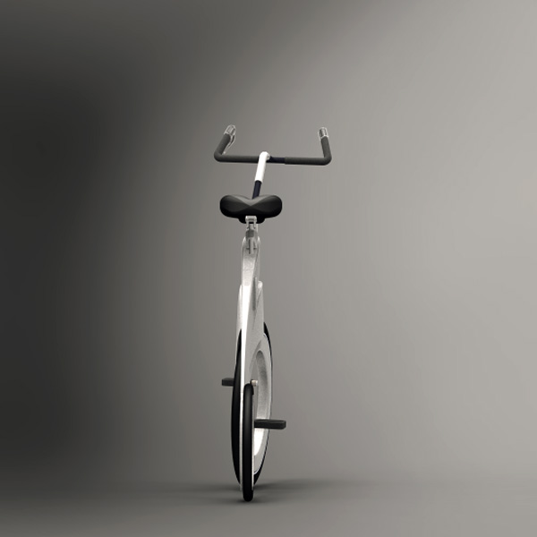
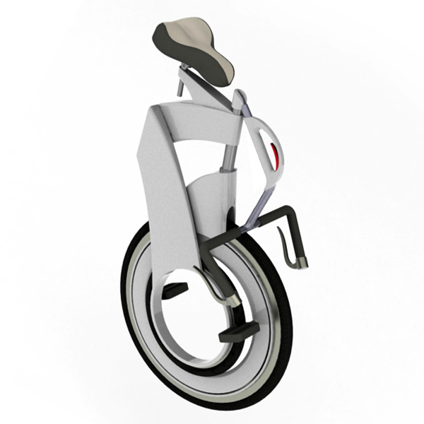
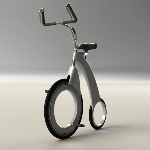
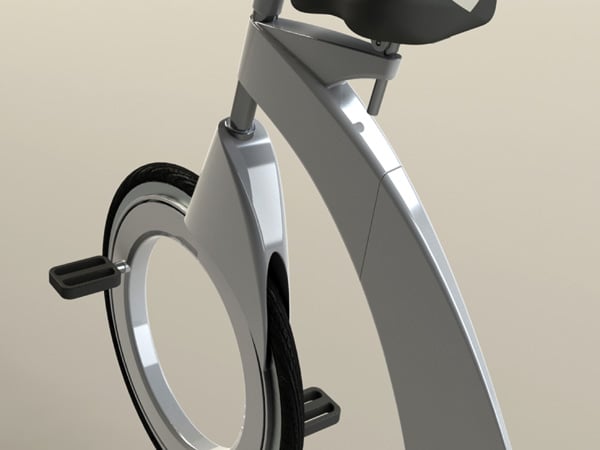
Diamove is yet another folding bicycle concept but with its own innovations. It’s an easy folding bike featuring front wheel drive to support better posture. While riding, the weight of your body is totally on the pelvis rather than your wrists and feet. It sports a wheel-in-wheel folding scheme with a “single- motion” swoop. The awesome part is that when folded, it’s just a single wheel body that you need to stack-up in a cozy corner, but don’t call it a unicycle!

Designer: David Damshek

Call for Submissions: Chicago Clean Air Design Challenge

air_breathe.png

Chicago-based design organization, Design Makes Change, is sponsoring a regional design competition with one goal in mind: clean air. The Air We Breathe; The Chicago Clean Air Design Challenge is open to designers in graphic design, architecture, interior architecture, product design, and public space design. The goal of the contest is to provide a platform for designers to come to the table with innovative and creative proposals to raise awareness about air quality issues and help contribute to a solution. One of their main objectives is to encourage research and community partnership in the design process.

Focusing on clean air in two of Chicago's most affected neighborhoods -- Pilsen and Little Village. Poor air quality is an issue that affects all Chicagoans. However, residents of Pilsen and Little Village live below two coal powered plants that regularly emit lead and other toxins into the air. High rates of asthma and other air-quality illnesses are pressing concerns for the residents of these neighborhoods and for much of Chicago. This is the critical environmental concern of the moment in your city and you are a designer. What will you do about it?

Deadline for submissions until April 18th 2011. The best selections will be part of a group exhibition and symposium scheduled for May/June in the Chicago Arts District. Download the application or get more information about the competition here!

Book Review: CULT-URE: Ideas Can Be Dangerous, by Rian Hughes

cult-ure-01.jpg

Rian Hughes' new book Cult-ure is bound in faux leather and gold trim. The biblical references don't stop there, as the author handily provides a fabric page marker for the reader to keep track of what page/psalm they're on. Interestingly, the yellow and black dust jacket barely covers the front. On the back of that caution-strip, explanatory prose clarifies the allusion, stating that Cult-ure is meant to be "Gideon's Bible for the boutique hotel."

Positioning the strip one way presents the reader with a fragment of the title "CULT," followed by the phrase "IDEAS CAN BE DANGEROUS." While he spends very little of the book addressing the Bible itself, the rational free-wheeling fount of ideas spilling from this book could easily be taken as an affront by people with religious memes. Indeed, even the word meme (which Hughes uses a lot) was coined by atheist commentator Richard Dawkins in his book The Selfish Gene, and refers to the survival of the fittest of ideas in the forest of the human mind. When Internet entrepreneurs refer to ideas spreading virally, they're talking about memes, and they, along with Hughes, owe quite a debt to Dawkins.

cult-ure-08.jpg


cult-ure-09.jpg

cult-ure-10.jpg

Hughes is a former comic book artist currently practicing in graphic design, but what makes Cult-ure relevant to design readers is not Hughes' background, but its connection to non-hyphenated "culture." Hughes references Tim Hewell's comment that, "the battle for ideas is far more complex than the battle for territory -- and likely to last even longer." Culture is where it will take place; every product designer thinking about market share should be thinking about share of mind. Especially in the wake of recent events in Egypt, new media resources allow for the spread of ideas faster than ever before.

cult-ure-05.jpg

cult-ure-06.jpg

Each two-page layout of the book contains a singular idea in text on the left page and photos and graphic design on the right side. One particularly compelling page is all black, with eyes peering out through a rectangular cutout as though a burka. The next spread reveals her face with the "missing" rectangular cutout over her mouth. To Hughes, anyone who tries to suppress rational inquiry and free speech, whether a religion or an autocrat, deserves to be mistrusted. We happen to agree.

cult-ure-11.jpg


cult-ure-12.jpg

Each spread has footnotes at the bottom that function as hyperlinks, referencing different topics on divergent themes. The author also explains that there are a number of nested jokes and codes hidden away in the text. One page includes a series of parallel lines representative of tall grass, but when you move away from the page, the face of a wolf in the grass appears as a visual trick. Another layout shows hands appearing to hold the book open showing the content on the pages prior, but the pagination is correct. The spread pictured isn't in the book; but the picture of the spread is! Loads of fun.

cult-ure-13.jpg


cult-ure-14.jpg

In terms of the written content, Cult-ure a tour de force skim of ideas, if such a thing is possible. Hughes clearly knows enough that he could write whole dissertations on any of the chapter headings. Instead, we're treated with amazing fragments and thoughts, like "your memetic footprint," or "CULT-URE" on one page, followed by "CULT-CURE" on the next. Interspersed between the text are digressions on particle physics and quotes from sources ranging from Richard Feynman to Oscar Wilde. The book is filled with ideas. Hughes quotes Alvin Toffler, who states that, "The illiterate of the 21st Century will not be those who cannot read and write but those who cannot learn, unlearn and relearn." Cult-ure certainly provides a lot of opportunities.

2011 Home + Housewares Preview: Student Design Competition

Illumine_Picture[1].jpg

In its 18th year, the Student Design Competition sponsored by theInternational Home and Housewares Show announced this year's winning product designs from students representing institutions from around the country. The design competition's annual challenge to students is to redesign a current housewares product to meet the needs of the future or to create a concept for a new product. Winning projects are selected for their innovation, understanding of production and marketing principles and quality of entry materials.

Wesley York, a senior studying Industrial Design at Southern Illinois University from Decatur, IL, won for his design of "Illumine" -- The Pathway to Safety, an emergency light built into an electrical outlet cover. Currently, commercial buildings mount emergency lighting at ceiling level, but during a fire, smoke rises and blocks the light. "Illumine" not only lights up the floor level, but has built-in red and green LEDs that show the correct way out of a building.

"Last semester, our industrial design professor tasked us with designing some sort of lighting, and I immediately thought about emergency lighting," York said. "My father, who has been a fireman at a chemical plant for 17 years, quickly confirmed that this is an issue in commercial buildings."

Larrow_Barnacle[1].JPG

Second place was awarded to Chet Larrow, a junior at the University of Cincinnati, for the "Barnacle" Air Purifier, a household air purification system, and Katlyn Ross, a senior at the Milwaukee Institute of Art & Design, for "Quick-Fix," a first-aid system that makes treating an injury fast and easy.

Quickfix.jpg

Using a battery-powered motor, the "Barnacle" takes in dirty air, removes pollutants and circulates clean air back into the home environment. The attractive unit can be magnetically mounted on appliances in the kitchen or placed on a table in another area of the home. The "Quick-Fix" system organizes a first aid kit's contents into smaller boxes that are labeled by type of injury or emergency, such as cuts, burns, stings, breaks/strains, choking and poisoning, and include simple instructions. The kits help users quickly choose the correct supplies and make first aid procedures more intuitive.

Joyce Safeguardian.jpg

Wu Eiffel.JPG

Yu Zou TheBLOCK.jpg

Three third-place awards went to: Brendan Joyce, a junior at Purdue University for "SafeGuardian;" Kevin Wu a junior at the University of Illinois at Urbana-Champaign for "Eiffel;" and Yu Zou, a junior at Arizona State University for "The Block."

"SafeGuardian" shuts off a garbage disposer when metal objects such as silverware or jewelry have fallen into the unit, and warns users with a flashing light. A portable single-serve coffee brewer with a reusable filter basket, "Eiffel" sits directly upon a cup and uses total immersion to extract more flavor from the ground beans. "The Block," a dishwasher-safe knife block made of low-impact materials, features a child lock to prevent children from removing kitchen knives and injuring themselves.

Honorable Mentions:
* Kathryn Asad, Pino: Measuring Tools for Low-Vision and Blind Users, North Carolina State University

* Gene Friend, "Mollie" Food Waste Dehydration System, California College of the Arts

* Ryan Geraghty, "Bol" Nesting Stacking Bowls University of Notre Dame

* Shingo Mamiya, "Raiser" Laundry Lift Bag/Hamper, Arizona State University

This year, 165 project entries were submitted from 23 design schools in North America and Europe. The winning product prototypes and their creators will take center stage in the Housewares Design Center at the 2011 International Home + Housewares Show.

Category Winners Announced for Brit Insurance Designs of the Year 2011

Brit-Insurance-Awards-Category-Winners.jpg

The category winners for the 2011 Brit Insurance Designs of the Year Awards were announced today and we were pleased to see the Plumen 001 take out the Product Award which we showcased late last year at ourHand-Eye Supply store. Flipboard deservedly won the Interactive Award and it's always tough comparing a bicycle to the complexity of a train or car in the Transport category but we were happy to see the Barclays Cycle Hire program selected.

Check out more pictures from the exhibition at the London Design Museum in our recent photo gallery here.

Brit Insurance Designs of the Year 2011: Category Winners

Architecture Award Winner
Open Air Library, KARO Architekten

Product Award Winner
Plumen 001, Hulger + Samuel Wilkinson

Furniture Award Winner
Branca, Industrial Facility

Interactive Award Winner
Flipboard, Mike McCue & Evan Doll

Graphics Award Winner
Homemade is Best, Forsman & Bodenfors for IKEA

Fashion Award Winner
Uniqlo +J, Jil Sander

Transport Award Winner
Barclays Cycle Hire, Transport for London & Serco

Rolls-Royce giới thiệu xe 102EX chạy điện

(Dân trí) - Được miêu tả là một trong những dự án quan trọng nhất của Rolls-Royce trong mấy năm gần đây, 102EX là mẫu xe chạy điện phát triển dựa trên Phantom.
Rolls-Royce dự kiến tổ chức tour vòng quanh thế giới để các khách hàng, VIP và giới truyền thông có cơ hội lái thử xe 102EX. Qua đó, hãng xe Anh quốc hy vọng nhận được phản hồi về mức độ tiếp nhận của thị trường đối với công nghệ ô tô chạy điện.

Bộ pin lithium-ion 71 kWh sẽ cung cấp năng lượng vận hành hai mô-tơ điện tổng công suất 389 mã lực (290 kW) và mô-men xoắn 800 Nm (590 lb-ft). Xe 102EX có khả năng tăng tốc từ 0 lên 100km/h trong chưa đến 8 giây và đạt tốc độ cực đại 160 km/h. Quan trọng hơn, Rolls-Royce dự kiến xe có thể chạy quãng đường khoảng 200km sau mỗi lần sạc điện.

Thời gian sạc đầy pin là 20 tiếng với bộ sạc một pha, hoặc 8 tiếng với bộ sạc ba pha. Ngoài ra, xe được trang bị một hệ thống sạc cảm ứng, cho phép chế độ sạc không dây. Để dùng hệ thống này, cần đậu xe bên trên một tấm cảm ứng.

Về hình thức, Rolls-Royce 102EX khác các xe Phantom ở ngoại thất màu xanh biển Atlantic Chrome và biểu tượng “Spirit of Ecstasy” sáng đèn và cổng sạc điện ở cột C.

Về nội thất, cabin thay nội thất ốp gỗ bằng những chi tiết nhôm kiểu đan sợi. Ngoài ra, ghế ngồi, sàn xe và tựa tay được bọc da Seton Corinova. Cụm điều khiển và đồng hồ được thay đổi cho phù hợp với xe chạy điện, như bảng hiển thị tình trạng pin.

Hiện tại, đây mới là dự án thử nghiệm công nghệ xe chạy điện, Rolls-Royce chưa có kế hoạch đưa 102EX vào sản xuất thực tế.


Nhật Minh
Theo WCF