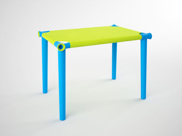


This brilliantly colored table by designer Carlos Pendas is a whimsical kid’s desk that uses tensed fabric as a surface rather than an ordinary hard top. The stretched fabric also doubles as a drum for an added touch of fun and interaction. Hangoo’s simple assembly can be completed in minutes and is so easy that even kids can participate in the process. Using stretched fabric reduces the overall weight, and a minimal amount of components means this design is cost efficient in both material and shipment.
Designer: Carlos Pendas


Introducing the Avery Dennison Brand Experience Contest, a worldwide packaging design contest that allows you to showcase your creative skills and vision. By taking a brand from inception to unveiling. From bottle to shelf. And everything in between.
Compete in one, or all five, categories: coffee, juice, shampoo, salad dressing, and wine & spirits. You'll be judged by brand owners and some of the world's best designers.
So, here's your chance to inspire, and bring your personal brand to life. The only cost is your creative brain power.
In May 2010, the New York design community lost one of its most prolific and influential designers of the current generation, Tobias Wong. Blurring the boundary between conceptual art and design, the work of Tobias questioned the value system of objects and pretensions of designers with wit, satire and humor.
Nine celebrated New York-based designers have come together to interpret and reflect the work of Tobias through their unique and individual design sensibilities.
Through the lens of Tobias we hope to gain new insight into our work by questioning our personal values, design process and the necessity of humor by remembering never to take life or yourself too seriously.
We here at Core77 are proud to present exclusive interviews with the designers next week, leading up to BrokenOff BrokenOff. Each of the designers we have spoken with have a personal story to share and a unique perspective to celebrating the life and legacy of Tobias Wong.
The designers will be participating in a conversation at Wanted Design NYC on Friday, May 13th. In addition, 50% of any and all profits from the show will be donated to the NYC Children's Art Fund, giving back to design and art education to underprivileged children in New York City.

Going a bit more hi-tech than the mail bins, Germany-based designerPatrick Frey uses Varioline, a name brand sheet plastic injection-molded with a closed-cell foam core, to make his sturdy yet lightweight Nook line of stools and benches for manufacturer Vial. (You've surely seen these before, as the Nook scooped up both iF and Good Design awards for 2010.) The Varioline is scored and cut via CNC, and the resultant shapes are folded into their finished forms.

We know what you're thinking: Isn't it wasteful to have all of that cutoff material? Not really, as the stuff is 100% recycleable.

There's an unedited video below of the CNC cutting up the Varioline. It's about three minutes long, but you only need to see ten, twenty seconds of it to get the idea.

See more on the CCA blog

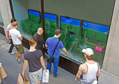
London's In Square Lab, an architectural practice that specializes in "Time-Based Architecture," recently collaborated with MPC Digital and Existential on "Urban Prairie," an interactive window installation in the heart of their hometown. The 5m window display consists of a row of optical sensors facing the street, which are programmed to translate the motion of passersby into a simulated breeze, embodied in the movement of grasses.

Of course, the installation is but a meter deep: hence, the flatscreens—which are also in sync with the cameras—that represent a virtual sea of prairie.

It makes more sense in action:
In this project, the main challenge for the team was to create a system that allows for maintaining or even extending the notion of green spaces through intelligent use of design and technology via 4th dimension (time + space) design [and] to inspire and provoke discussions and speculations about the concept of inside vs outside, here vs there and virtual vs realism.Using an array of optical sensors and arduino boards, urban prairie captures and comprehends the movements of passersby in front of the installation. This digital data is then translated into kinetic responses via a series of servos; creating the phenomenon of a sea of grass swaying in the breeze. The motion of the 'real' grass is in turn measured by the specially designed software and translated to a field of virtual prairie on screens behind the 'real' grass. The combined result is an 'Urban Prairie' which passersby can engage and interact with through their movements in space. By varying their speed and location in front of the windows, passersby can generate wind disturbance that travels from the 'real' grass to the virtual prairie seamlessly and eventually fading off into the horizon.

"Time-Based Architecture" is an emerging field that is concerned with intelligent interactions between an environment and its users. This practice follows from advances in technology and new media, which enable real-time engagement.

I personally feel that the physical "grass" in the foreground is rather more successful than the digital displays, though it may just be an unavoidable shortcoming of the photo/video documentation... perhaps it would be more immersive if the background was projected onto the entire back wall? In any case, I'd be curious to see this project executed on a larger scale in, say, New York's High Line.

If "Urban Prairie" and "Be Your Own Souvenir" are any indication, we're definitely seeing some clever (if not quite perfect) applications of new media in the real world. Between increasing availability (i.e. the Kinect) of hardware and creative software programming, I can't imagine what is on the horizon—real or virtual—for interaction design.
Pro-ID Design by Topwpthemes. Converted By Ha Nam Son , Email: pro.idgroup.vn@gmail.com Or swin9986@gmail.com .