11/1/11

Book review: Victore or, Who Died and Made You Boss.

victore_review_01.jpg


James Victore's new monograph is so slick that a stranger on the subway asked us what we were reading because he "needed a new book." The design strikes such a careful balance between craft and irreverence that has the same appeal as the cool kid in school that never followed the rules but still graduated on time.

The matte black pages provide a striking contrast to a typically bound book, even when closed, and the cover painting sandwiches those uncommon pages between a carefully defaced oil painting festooned with Victore's trademark hand illustrations (scrawled painted words and a Van Dyke goatee) combined with a stark typeface arrangement. The cover itself actually forms a fold-out of the painting that can serve as a poster, Victore's stock and trade. From the cover on in, the monograph is just as boisterous and freewheeling an exploration of the bounds of graphic design as James Victore's career has been.

victore_review_09.jpg

On the inside cover are a series of what this reviewer suspects were abandoned title possibilities in bold white type with strikethroughs, but they could just as easily serve as rules that are meant to be broken, such as "Location, Location, Location," or "It's Not About Persuasion." A few pages further intrepid readers will discover the most irreverent inspiration list we've ever seen including such gems as "Salvador Dali, for his mustache, not his painting," "Franz Kline, for his painting, not his mustache," and "Patrick Swayze, but only for Road House." The book is overstuffed with too many throwaway gags and in jokes to mention in the intro pages alone, so it's worth moving on to the content inside the actual graphic design.

victore_review_02.jpg

Once we get past the stark cover credits, we finally get to Victore's work. He cut his chops on book covers and the visuals are dynamite. Almost all are photograph or collages with scrawls on top, but the wit and spontaneity that drove them takes precedence over the craft of the line. A few standouts include a military photo with white lines cutting up a soldier like a butchers diagram for Johnny Got His Gun and a stark black cover with white teeth for The Werewolf of Paris..The poster content that follows is irreverent and raw. Explaining that that when he went looking for his posters, they had disappeared, Victore says, "I had made something that people wanted to steal." Well, in this case you have to pay for it, but the sheer volume of creative energy contained in Who Died and Made You Boss is sure to inspire and entertain.


victore_review_03.jpg

victore_review_04.jpg
victore_review_05.jpg
victore_review_06.jpg
victore_review_07.jpg
victore_review_08.jpg

Book Review: Predictable Magic: Unleash the Power of Design Strategy to Transform Your Business, by Deepa Prahalad and Ravi Sawhney

predicatble_magic_01.jpg

The Predictable Magic to which Prahalad and Sawhney refer in their recent book has been given the moniker of Psycho-Aesthetics, and Ravi's firm RKS has applied it successfully to a range of products over his career as a consultant. What they're getting at is not what is commonly recognized as aesthetics (the visual sense). Instead what looks are to the eye, Psycho-Aesthetics are to the soul or the psyche. In the Afterward they provide the clearest description of their end goal: "It's not how you feel about the design or the experience; it's how it makes you feel about yourself."


Between the Preface and the Afterward, however, the reader needs to learn just how to make that happen. The core of the book serves to create a framework for the repeatable creation of products that connect with the end user emotionally. The book is structured in chapters that reflect each step of the process by the acronym EMPOWER. While it's not worth belaboring what each letter stands for, some chapters are worthy of describing in detail. When they describe "Mapping the future" they present a quadrant chart with interactivity along the x-axis and basic functionality to dynamic empowerment along the y-axis. The map can function like any competitive landscape (i.e. the company would be well served to attack areas where their competitors are not) but it's the upper right quadrant that's the sweet spot. Motorola's RAZR was gorgeous but had a limited feature set and the Blackberry was so functional that it's widely used even with a large and heavy form factor. Only the iPhone in the upper right quadrant managed to engender so much adoration that people use itdespite the call quality.

predicatble_magic_02.jpg

Predictable Magic introduces the psycho aesthetics framework through the phone example above at the "M" but does not bring it to it's resolution until the "O" of EMPOWER. Each example is carefully shepherded through the book to give the reader a strong sense of continuity. Once they've described how Psycho-Aesthetics can be used to position a company, the authors reiterates each of the case studies they've shown thus far as a progression from on quadrant in the Psycho-Aesthetics map into another that serves the company better.

Part II involves the implementation of the aforementioned strategies in ways that engage the customer base. The general thesis that a satisfied customer base will result in a financially rewarded company is attacked from an emotional standpoint. A case study of the MiniMed insulin pump demonstrates just how important the feelings of the customer can be. Simply by adopting the form factor of a socially acceptable pager, MiniMed was able to let their customers feel socially unencumbered by their diabetes. Once the usage of a product can be turned into an emotional experience, less focus is required by the sales force because the customer base itself is evangelizing. In the era of social networking, some of these discoveries now seem evident, but RKS has been doing it for decades. Industrial designers on the cusp of the new social era would be well served to pay attention.

predicatble_magic_03.jpg

Nendo "dancing squares" at Art Stage Singapore

shelf_002.jpg

Prolific Japanese design firm Nendo will be exhibiting a new collection of interior objects at Art Stage Singapore, an art and design show debuting for the Asia Pacific market. Nendo's "dancing squares" series assembles square planes to create a sense of motion in every day objects.

One part of the bookshelf is frozen in its cascade of tumbling shelves, creating variety in the way books can be stacked. The stool's twist endows it with visual play. Lamps roll about but are stable, thank to their planes, and cast light in different directions. The table leans as though falling away, but maintains its function as a table, and makes objects placed on it seem to sink into its folds and sways. The different 'movements' make balance and unbalance overlap, as though we are watching the planes themselves dance.

Art Stage Singapore debuts January 12th-16th at the Marina Bay Sands.

lamp_004.jpg

stool_003.jpg
table_002.jpg
no boundaries ad.jpg

Clever dispenser design combines benefits of liquid and bar soap

0soapflakes003.jpg

Eindhoven grad Nathalie Stampfli's brilliant Soap Flakes dispensers use bar soap while taking cues from cheese graters and peppermills. As you can see in the photos, the user inserts a bar into the devices--one design is wall-mounted, the other handheld--and it then dispenses soap flakes.

0soapflakes004.jpg

Why make something like this? As Stampfli explains,

Today, most of the soap we use is liquid soap, which contains a lot of water. Block soap instead is more concentrated and therefore has some ecological benefits: You don't transport unnecessary water around. In place of plastic bottles you can simply use paper for packaging. The solid blocks can easily be piled and allow a greater space efficiency in a truck.

But what about the usage of soap bars? I don't like the weird slippery feeling when I use them. It gives me goose bumps. And under the shower, it always slides out of your fingers. Hand soap also often gets dirty and accumulates bacteria when more than one person is using it.

0soapflakes005.jpg

via kottke

10/1/11

The Innovative Concepts and Futuristic Designs of Igor Chak

We’ve all seen some of the beautifully designed cars out there. The Lamborghini Murcielago, the Ferrari Spider, of those gorgeous muscle cars from the 60s and 70s. However, there’s a lot of conceptual work the general public is never sold or gets to see on the streets. Welcome to the work of Igor Chak.

izh 1

Innovative and futuristic, the concepts of Igor Chak dazzle the eyes. Take the Donkey Kong wall, for example. This imaginative wall display is the perfect match for any crazed fan of one of the original Nintendo classics. Made of carbon fiber and held up by steel rods, they are meant to imitate the eccentric steel beams from the Donkey Kong games. What’s great about them is the pink ‘pixelated’ lines running between either plank of each segment; they make it look just like an old Super Nintendo video game!

igor chak 2

Check out the watches he’s been designing, too. Sleek and lustrous, they’d certainly turn some heads. With an electronic screen that displays the time on a dial instead of in numbers, Version 1 of the watch is unique in that it shares elements of the technology from the past and from the present. Version 2 is even more interesting. Boasting a display of two times zones simultaneously in the same ‘future/present’ manner, you’ll have hard luck finding anything else like it!

igor chak 3

By far the coolest thing Igor Chak has designed is the Izh Hybrid Concept. Not yet built in real life, the Izh is so new-looking that it even bears similarities to some of the flying vehicles from Star Wars! A great mixture of sharp edges and smooth surfaces, this concept combines the muscular features of big choppers and the more grace of moderns motorcycles.

motorcycle 2

If you liked the concepts of Igor Chak, you should also check out the Dinosaur Skeleton Motorcycle and the Donkey Kong Castset!

Via: The Igor Chak webpage

Taxi Green Mumbai Provides Green Solution For The Inner City

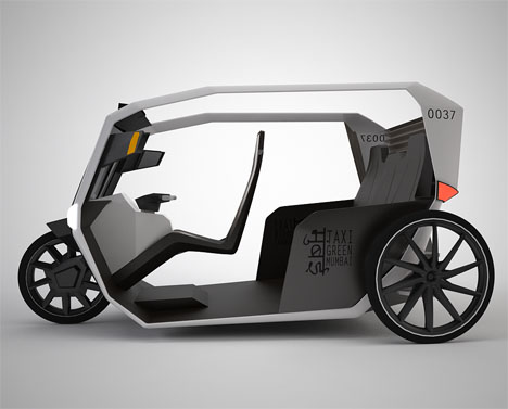
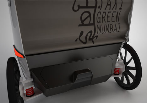
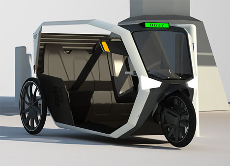
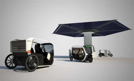
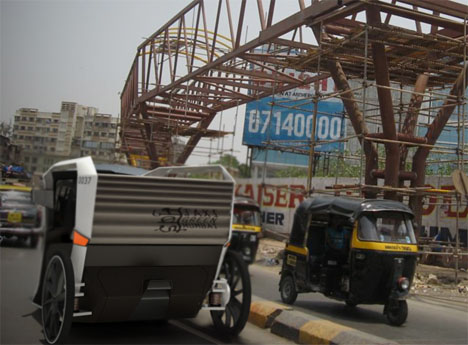
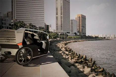
In the center of Mumbai, India, gas-driven Rickshaws are prohibited because of their noise and their pollution. By combining an electric drivetrain, which is supposed to be funded by the government, with a network of solar filling stations, Taxi Green Mumbai provides a clean and green solution for the inner city. It reaches up to 300km on a single fill, which makes it useable for one day of driving at a top speed of 30km/h. The design takes its clues from old Rickshaws and their history in the last century. To make it as simple as possible, the whole electronic system is limited to the front part of the vehicle. The battery is located beneath the passengers, as well as a small luggage compartment, which can be locked from inside the cabin only. As there is a lot of rain in Mumbai, the cabin can be partially closed on the sides by pulling out a canvas cover. When there is good weather, the roof of the vehicle can be opened to enjoy the drive.

Designer : Michael Scherger, Nina Thöming, and Henrik Mucha

Taxi Green Mumbai

Taxi Green Mumbai

Taxi Green Mumbai

Taxi Green Mumbai

Taxi Green Mumbai

Taxi Green Mumbai


Giấy điện tử màu đầu tiên trên thế giới

Wisereader E920 là thiết bị đọc sách sử dụng giấy điện tử màu, thiết bị do Hanvon sản xuất. Khác biệt với của sản phẩm này là Wisereader E920 cho phép người dùng chủ động chọn chế độ màu hoặc đen trắng.

Chất lượng màu sắc do Wisereader E920 đem lại có thể chưa làm hài lòng những người dùng khó tính bởi nó thể rực rỡ như các màn hình LCD. Tuy nhiên, với các cuốn truyện tranh thì Wisereader E920 thực sự phù hợp để lựa chọn.

Wisereader E920 có màn hình cảm ứng rộng 9,7 inch độ phân giải 1200x1600pixel, mật độ điểm ảnh lên tới 200dpi. Thiết bị có thể cắm thêm thẻ nhớ để mở rộng dung lượng lưu trữ. Ngoài ra, thời gian chờ của pin lên tới 15 ngày hoặc tương đương với lật 10 nghìn trang giấy. Sản phẩm dự kiến ra mắt vào tháng 6 năm nay và có giá khoảng 500 USD.

Hanvon là nhà thiết kế và sản xuất các sách điện tử chiếm tới 95% thị phần sách điện tử tại Trung Quốc. Hãng này cũng là một trong những nhà sản xuất đi đầu trong việc tích hợp khả năng nhận dạng chữ viết trên giấy điện tử.

Theo Lao động

The New Flip Phone

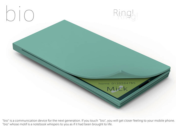
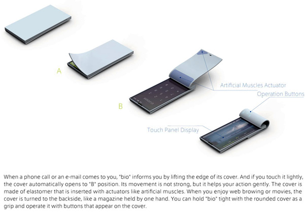
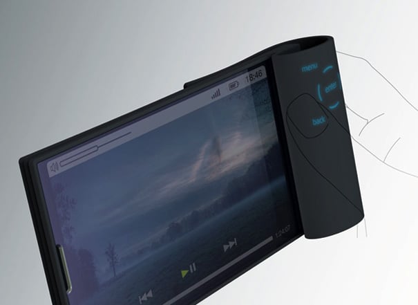
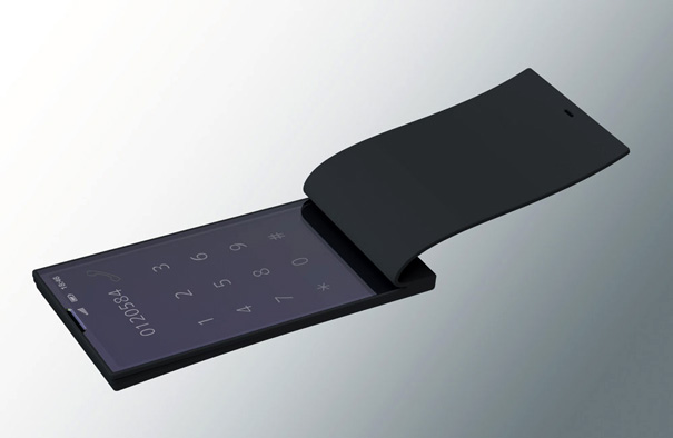
Here’s a flip phone that could put the “cool” back into clamshells. When you receive an incoming call, the corner dog-ears up and if need be, opens up (book-style) using actuators like artificial muscles in its elastomeric cover. Awesome! Motorola StarTAC 2.o maybe?


Softness for Child Sitting

Here’s a project consisting of three different bits of children’s furniture, each of them able to not only accommodate the child’s sitting, playing, and laying, it can also contain a whole batch of toys inside! Each of these bits of furniture is made of light foam so that the kids cannot hurt themselves whilst playing, and leatherette which is eco friendly false leather. Each of the furniture bits can be cleaned easily, and the color schemes are what the designers call “sober.” I must agree.

Each of these soft creatures, part of the “Soft Gang,” has a complete lack of facial features, no ears, no hair, none of that – allowing then the child’s imagination to run wild. One of the designers, Luiza Kwiatkowska, suggests they might be seen as a rabbit, a horse, and a fish! All are lovely.

Designer: Creature Industry


CES 2011 Part 3

Just three days into CES, the buffet foods, complimentary candies, sleepless nights, coffee and energy drinks are taking their toll on everyone, everyone but me because I came prepared. I’m dressed to the nines, rocking my freshly knitted tabi boots, constantly sucking on my Water Bobble, here to bring you part 3 of our coverage.

Exhibition: CES 2011 Part 3

While everyone is drooling over the super thin LED TVs, InnVision Lab’s HoloAd Diamond has my full attention. It’s kind of odd looking but the tech is proof in the pudding. Not exactly sure how, but the system is able to convert 2D video into some kind of sudo-holographic 3D image. That puffer fish was almost as real as those seashells.

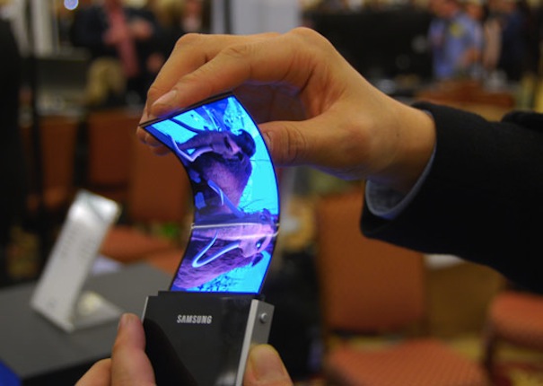
Samsung showed off its latest wares in super thin, flexible displays. The 4.5″ AMOLED prototype carries a 840 x 480 resolution. Barely 0.3 mm thick, it’s quite “bendy” but the image never distorts. It’s incredibly sharp and other than cost, I can’t see why we shouldn’t see it mass produced soon.

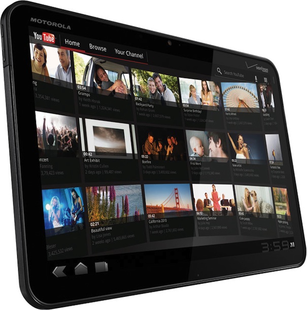
The Motorola Xoom is by far the best in show in the tablet category. Android 3.0 Honeycomb, 10″ display, HD resolution, dual-core processors, front and rear facing cameras, 10 hour battery, and it’s its own mobile hotspot providing Wi-Fi access up to five other devices. The hardware is beautifully designed – basic and utilitarian.

The X100 is Fujifilm’s entry into the pro-sumer camera market. All of the tech inside makes it comparable to other compact SLRs so they’ve opted to go retro in industrial design. I’m not usually partial to retro styling but this thing was damn fun to use. The new Fujinon 23mm f/2.0 pancake lens produced some awesome pictures on the 3.0 screen. Expect it in March.

WheeMe is a palm-size robot that gently massages and caresses as it moves slowly across your body. Embodying a unique tilt sensor technology, it automatically and silently steers itself over your body without falling off or losing its grip. It’s no Swedish massage but I was tickled. Yea.. I’m getting one.

Our best buddy Bluelounge had a booth at CES to unveil the Nest iPad stand and StudioDesk XL. As usual they’ve come up with the simplest, smartest solutions for everyday problems. The Nest props the iPad up multiple ways and has a built-in caddy to store tchotchkes. The StudioDesk XL is a gorgeous mahogany table designed to hide all those unsightly cables. Totally drooling for one. Both are available this Spring if not sooner.

And yea… I’m the one wearing knitted tabis. Hey, a unicorn herding ninja has got to stay warm somehow.