11/9/10
Book Review: Design is How it Works: How the Smartest Companies Turn Products into Icons, by Jay Greene

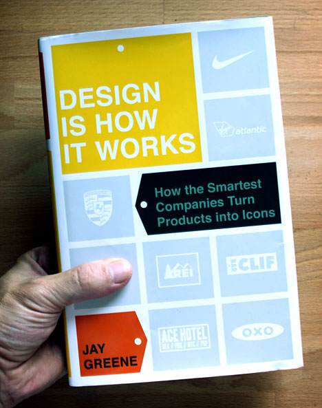
Jay Greene's new book on the power of design wears its affiliations right on the book jacket. The logos of all eight companies he profiles are stamped right on the cover, although perhaps Virgin Atlantic gets an extra psychological shout-out, since the subtitle and author credit seem to owe a little debt to the form of luggage tags. We here at Core77 are always happy to see new books touting the power of design to business executives, but we haven't yet figured out whether the constant onslaught of new books signifies a real change in the way companies do business, or whether its simply another signpost promising an Apple-like future to executives clueless about how to execute the changes needed to establish a design culture.
Interestingly, while, Design is How it Works takes its title from a Steve Jobs quote, Apple is not one of the companies Greene profiled. Instead, Greene's book stands as the first post-Apple design book we've profiled here. The contribution of design to Apple's success is taken as a given. Instead, the reader is only presented with Apple in the introduction, as a framing mechanism to contrast with Bang & Olufsen's equally beautiful products. What Greene aims to demonstrate is that the Bauhaus taught us that design is material beauty and simplicity (B&O), Jobs and company have taught us not to look at design, but to experience it. The following case studies fully support that thesis, but it's a pearl of wisdom or two in Clif Bar case study that should get corporate America's attention.
Even though we are spared another Apple case, a few of the usual suspects show up early on. Sam Faber's OXO is profiled; complete with the canonical story of his wife Betsey's arthritis and how that led from bicycle gripped vegetable peelers to a wide range of ergonomic cooking utensils. What Greene does differently than most other business book writers is dig deeper, not just repeating the story anecdotally but interviewing the key players to try to find what drives them. The OXO case study is supportive of one of his main theses, that the way to craft successful products that drive sales is to pay attention to users on the fringes of the customer base. Greene calls these users outliers, but REI, Clif Bar and Nike might call them extreme athletes, while Virgin Atlantic has its road warriors and Porsche has speed freaks. For OXO the elderly or the arthritic may be sensitive to form factors that healthy and youthful users might ignore. Correcting the product for the needs of that outlier population actually enhances the product for the rest of the user base. In that industry, designing for the fringe actually promotes "universal design." But for other companies like REI ("Recreational Equipment Inc." -- we did not know this) catering to the outliers means something very different. For that company, the hard core user might need a sleeping bag rated for arctic temperatures. For the core user, a bag like that is total overkill, but just like for OXO, exploring the needs of the fringe quickly reveals problems with products that would never be identified by the casual user. Only from that standpoint can products be improved from good to great.
Each of the case studies in Design is How it Works reinforces two central tenets: (1) deep user ethnography (even more helpful when the employees are the end users) is the surest way to successful products, and (2) design is not something than can be stapled on to the surface of a product; it needs to be driven by corporate culture, as end-users can smell inauthentic products a mile away. Of those two maxims, the first is eminently achievable by any mid-level executive with sufficient resources in almost any corporate environment. The second, however, is far harder. In the sixth chapter of the book, Gary Erickson, hard-core cyclist, end-user, founder and authenticity checker of Clif Bars observes that his private company can set its own goals, pace themselves and experiment on their own schedules, unlike public companies who must answer to their shareholders. Although almost all of the companies profiled by Greene eschew focus groups in favor of ethnography and a guiding corporate structure, each case demonstrates that when the customer is ignored or misevaluated, problems occur. The clearest lesson of Design is How it Works is that the end-user must be listened to, if not in focus groups, at least in spirit. Erickson observes that public companies answer to the shareholders, not the end users. Paradoxically, companies like Apple that focus on satisfying the customer maximize shareholder value, while those focused on maximizing shareholder value often lose sight of the long term picture. For us, while it's thrilling to see yet another book cater explaining the power of design to executives, we'd be even happier if Wall Street got the memo.
Core77
No Response to "Book Review: Design is How it Works: How the Smartest Companies Turn Products into Icons, by Jay Greene"
Leave A Reply