10/10/10
SAYL: Fuseproject's Brand New Chair for Herman Miller


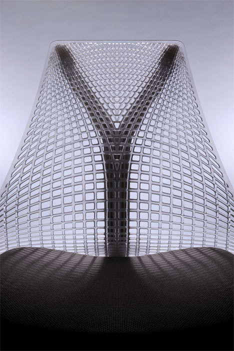
The Golden Gate bridge provided the inspiration behind fuseproject's newSAYL chair for Herman Miller—its unique, frameless back mimics the tectonics of suspension bridges, providing ergonomic support with no hard edges. Though prototyping began in wood and rope, the trademarked "3D Intelligent Suspension Back" is enabled by a proprietary urethane and two additional trademarked inventions: the ArcSpan&tm; seat base and the Y-Tower&tm; suspension structure. Both elements assist in holding the urethane sheet in tension.
According to Herman Miller, this structure creates a chair that is fully supportive—with a thickening and hinging of the urethane sheet in the sacral, lumber and spine areas— but also flexible, responding to the movement of the chair's occupant.

After completion of the design of the chair's main elements, fuseproject continued refining lesser details, lightening the physical and visual weight of the chair as much as possible. For example, the tilt mechanism undercarriage and arm structure were integrated with the ArcSpan seat. Structural members were sculpted and hollowed out, becoming diagrams of the structure they provide. Adjustment knobs and paddles become tactile with the bare minimum of materials.
In addition to maximizing the chairs visual impact, the minimizing of details also means that less materials are consumed in fabrication, following what Béhar has termed an eco-dematerialised&tm approach (there's that trademark again). Herman Miller ensured that the materials used are sustainable, targeted to achieve the MBDC Cradle to Cradle Silver, BIFMA level 2, and GREENGUARD certifications.

Finally, the name SAYL comes from the sailing vessels that pass beneath suspension bridges, with the Y recalling the Y-Tower structure in the back of the chair.
If you're interested in learning more, here's a brief excerpt from Béhar's design statement, provided by Herman Miller:
Too often, task chairs look assembled from a kit of parts, and often they are. There is a dance between SAYL's functional engineering work and its cosmetic shaping, and there is a relentless desire to have parts run fluidly into each other. For example, I was particularly interested in making the arms look as if they were stretched and growing seamlessly out of their height adjustment posts. There is also the idea of separate parts drawn as if conceived as one: The SAYL's frameless back is shaped to both express the tension distribution from the top attachments, and visually follow the form and exposed ribbing of the YTower.As a result, the two parts are visually layered as if one.In my opinion, Herman Miller does not sell a style, but rather a set ofinventions that are identifiable as the most radical in the industry. Butwhat makes the chair relevant now? It was important to reflect theworkplace now and communicate the new horizontal nature of 21stcentury corporate structures. SAYL gives a sense of visual lightness andtransparency rather than a status-announcing design, and anergonomic feel that is biomorphic. At the same time SAYL has a senseof humility and attempts to achieve high-tactility design rather thanvisual statement. The chair screams design intent when viewed andtouched by the sitter in close proximity, but from afar it almostdisappears. The workplace is not about chairs and what they say aboutthe people that sit in them; it's about the humans and their work. Tothat effect, SAYL appears smaller in scale, and its dematerializationmakes it more transparent in the environment.


No Response to "SAYL: Fuseproject's Brand New Chair for Herman Miller"
Leave A Reply