7/12/10
Why Do So Many Designs or Products Look The Same?
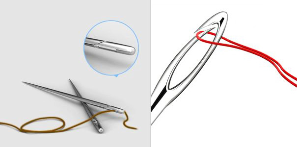
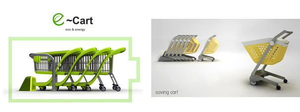
Ever wonder why so many products look the same? On the surface, it may appear designers have found the ideal form factor so there’s no need to change anything, but there’s more than meets the eye. The reasons are deeply rooted and the key to breaking the mold is to first understand why. Hit the jump! Contributing Editor: Brian Ling I’m surprised to see two similar designs have won the 2010 iF Concept Award. The Easy Needle (left) and the Ppin Needle (right) were both created by students from Zhejiang University in Hangzhou, China. Here are another pair of ideas, the e-Cart on the left and the Saving Cart (which won an iF Award as well) on the right. Both concepts seem to revolve around the idea of converting kinetic energy into stored latent energy as the trolley gets pushed around by a shopper. Time and time again we see it, and we often wonder why designers (assuming they work independently) seem to come up with similar design solutions? I thought it would be a good exercise for us to understand and be aware of the conditions that could lead to similar design solutions. One of the biggest reasons why we have similar products is that these designs come similar briefs. There is a good chance that the designs for the needles came from a studio project when the lecturer asked the students to design products along a similar theme. I noticed the students came from the same university. Along these same cognitive lines, designers could be faced with briefs requesting an Mp3 player that is just another “iPod, but better”. Though such briefs are not as common as they were five years ago, designers need to ensure they create a better design brief by challenging assumptions and focus on identifying objectives or problems. While I believe in the freedom of a tight brief, a limiting design brief is another condition to be watchful of. A good example is when you are developing tried and proven products and the client asks you to just “design something nice on the outside”. Sometimes it may be no fault of the client, especially when there is a huge mechanical component. They simply just do not understand and it is your job to use design to reconcile it. Clients requesting or limiting design activity to things such as a design refresh, body or face-lift with little or no architectural change can result in similar looking products. While not something every designer cherishes, this is unfortunately the bulk of most design work in consumer electronics and probably why many products look very similar in that industry. Often it is about managing expectations. Many clients may not be aware of the outcome, but are only limiting the design activity for purely financial reasons. They may also naively think that a design is about “skin deep” aesthetics and by just changing its look, will give them a new product. Broadly put, working rigidly by using a similar design process or methodology could result in similar looking designs. A good example is in university design courses that have a more technical or mechanical approach to design refinement. Though not necessarily a bad thing, their graduates often run very similar looking portfolios with technical resolved solutions. Another angle we can look at is in a studio environment lead by a strong individual that has a distinct way of working or visual style. Luminaries such as Karim Rashid, Marc Newson or Philip Starck have distinct visual styles you can spot instantly. This can also happen in smaller more traditional design consultancies that are lead by a strong creative director who encourages the team to approach problems in a certain way. That is why it is always important to challenge, vary or tailor our design processes to fit a particular design problem. Lower complexity products, which some designers also call low or no tech products, may lead to design solutions that are quite simlar. The reality is that many of these products were invented years ago, and the functionality of such products are tied to its construction. Things like the needles (above), cutlery, plates, furniture, lamps toothbrushes are so straightforward and simple to make that it is challenging to do something different. I am constantly amazed by designers that can continue to create fresh designs from such simple products. Sometimes the simpler a product, the more difficult is becomes to design. A small mistake can be amplified many more times than it normally would. It is a dangerous mistake for new designers to look for inspiration like magazines. Looking at other products for a market competitive study is fine, but when it comes to inspiration, you will very likely reproduce designs that are similar. I remember when Apple introduced the first iMac with their range of transparent bubble gum colors. Suddenly every product in the market was transparent bright blue or orange. Designers were just sick. But designers were not cured. The same story followed with glossy white or black materials, and more recent geometric designs with the promise of simplicity stamped right on its metal body. I’m glad to see that things are starting to change, however I still get nervous when I hear clients wanting to be the Apple of the “X” industry. More specifically, they want their products to reflect the same Apple look and feel rather than adopting the visionary and risk management style of the company. —– So there you go, four possible conditions that could lead to similar looking products or designs. Do you have any more to share? Have your say in the comments below. I hope you enjoyed reading this as much as I have writing it, and I’m looking forward to reading your comments. Brian is a multidisciplinary industrial design leader that goes under the pseudonym of “The Design Translator”. Formally a Senior Design Manager at Philips Design, he currently runs a Strategic Design Consultancy and muses about the strategies for good (industrial) design over at Design Sojourn. He often laments the lack of good soy mochas and Italian pizzas (with Rocket and shredded Parma ham) in Asia. Yankodesign

Working with Similar Design Briefs, or Briefs that Want the Same Thing.
Overly Limiting Design Briefs
Working with Similar Processes
Designing Lower Complexity Products
Working with Similar Visual Stimuli, or a Popular Visual Style
No Response to "Why Do So Many Designs or Products Look The Same?"
Leave A Reply